Unifying a Multi-Product Ecosystem
Redesigned a fragmented enterprise platform by unifying four independently developed products through shared navigation, scalable design systems, and consistent interaction patterns.

Back to All Works
Scope
Enterprise Product Design · Design System
Platform
Web & Mobile Application
Timeline
3 months
YEAR
2024

01/
NDA restrictions
Confidentiality Notice
This case study has been adapted to comply with a Non-Disclosure Agreement (NDA). Branding has been anonymized, sensitive information has been removed, and selected project details have been modified.
To protect confidential materials, the design process is presented at a high level while accurately reflecting my responsibilities, design decisions, and overall methodology.
The purpose of this case study is to demonstrate my approach to solving complex product challenges and delivering scalable solutions within tight project timelines.
02/
Background
Project Context & My Role
The company provides a workforce management platform that helps organizations manage mobile employees, reimbursements, compliance, and reporting through multiple connected products.
Over time, each product had evolved independently, resulting in inconsistent navigation, duplicated interaction patterns, and fragmented user experiences. Users frequently switched between products but were forced to relearn the interface each time.
I joined the project to evaluate the existing ecosystem, identify usability issues, and establish a unified experience across web and mobile while creating scalable design systems for future product growth.
During this three-month engagement, I was responsible for:
- Auditing the existing product ecosystem
- Conducting UX research and usability evaluations
- Redesigning key user journeys
- Improving information architecture
- Creating mobile and web design systems
- Collaborating with stakeholders and developers throughout implementation
03/
Problem
The Challenge
Redesigning individual screens wasn't the biggest challenge.
The real challenge was creating a consistent experience across multiple independently developed products without disrupting existing workflows or slowing down product delivery.
Within a limited timeframe, the solution needed to improve usability while providing a scalable foundation for future development.
Inconsistent Product Experience
01

Each product introduced different navigation models, interaction patterns, and visual styles, forcing users to repeatedly adapt.
Fragmented Navigation
02
Moving between products disrupted users' mental model, making common tasks slower and more confusing.
Limited Timeline
03
The ecosystem assessment, redesign, and design system creation all needed to be completed within only three months.
Scalable Foundation
04
The solution needed to support future product development across both web and mobile platforms while maintaining consistency.
04/
Approach
Design Process
Rather than redesigning individual interfaces, I approached the project as a product ecosystem.
The process began with understanding user workflows and identifying inconsistencies across products before defining a shared design language, restructuring navigation, and creating reusable systems that could scale across future releases.
DISCOVER
Stakeholder alignment
||
Product audit
||
User interviews
||
Usability evaluation
||

DEFINE
Problem prioritization
||
Information Architecture
||
Navigation strategy
||
Design principles
||

DEVELOP
Mobile redesign
||
Web redesign
||
Component standardization
||
Design system creation
||
DELIVER
Documentation
||
Design system handoff
||
Stakeholder validation
||
Future recommendations
||
05/
DISCOVERY
Understanding Users & Products
Research focused on understanding user behavior, identifying recurring usability issues, and mapping inconsistencies across the product ecosystem before defining design priorities.
Research combined stakeholder interviews, usability testing, and product audits to uncover recurring usability issues shared across multiple products.
User Interviews
Primary focus
Discover needs, frustrations
Methodology
Conduct and record remote interviews, synthesize themes
Key Metrics
6 internal users from different departments
Tools
Video calls, Google Forms
User Interviews
Primary focus
Observe real users interacting with prototypes or products. Task: Review various statistics and reports for three different users.
Methodology
Record sessions, note behaviors and ease of task completion
Key Metrics
Task Success Rate
Time on Task
Bug Volume
Tools
Hotjar - heat mapping, screen recordings. Live sessions

I often got confused when switching between the main product and the one with statistics. It wasn’t clear how to go back, and I kept getting lost. Some buttons and menus also looked different in each product, which made things more confusing. It slowed me down and made using the system harder that it needed to be
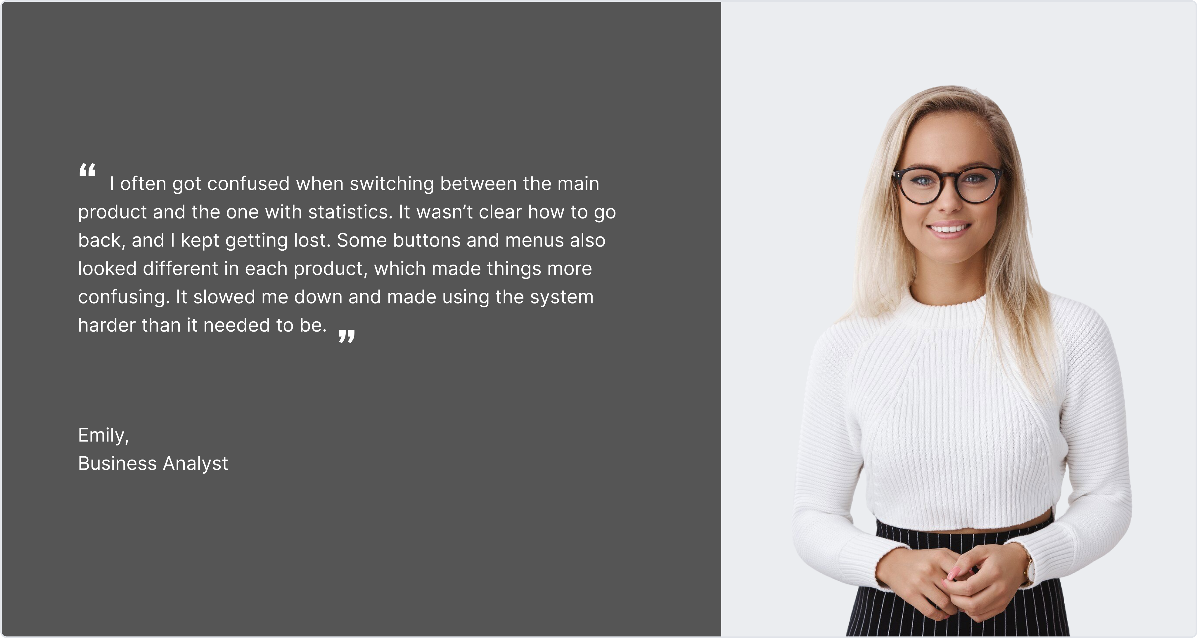
Emily
Business Analyst
06/
MOBILE EXPERIENCE
Creating a Consistent Mobile Experience
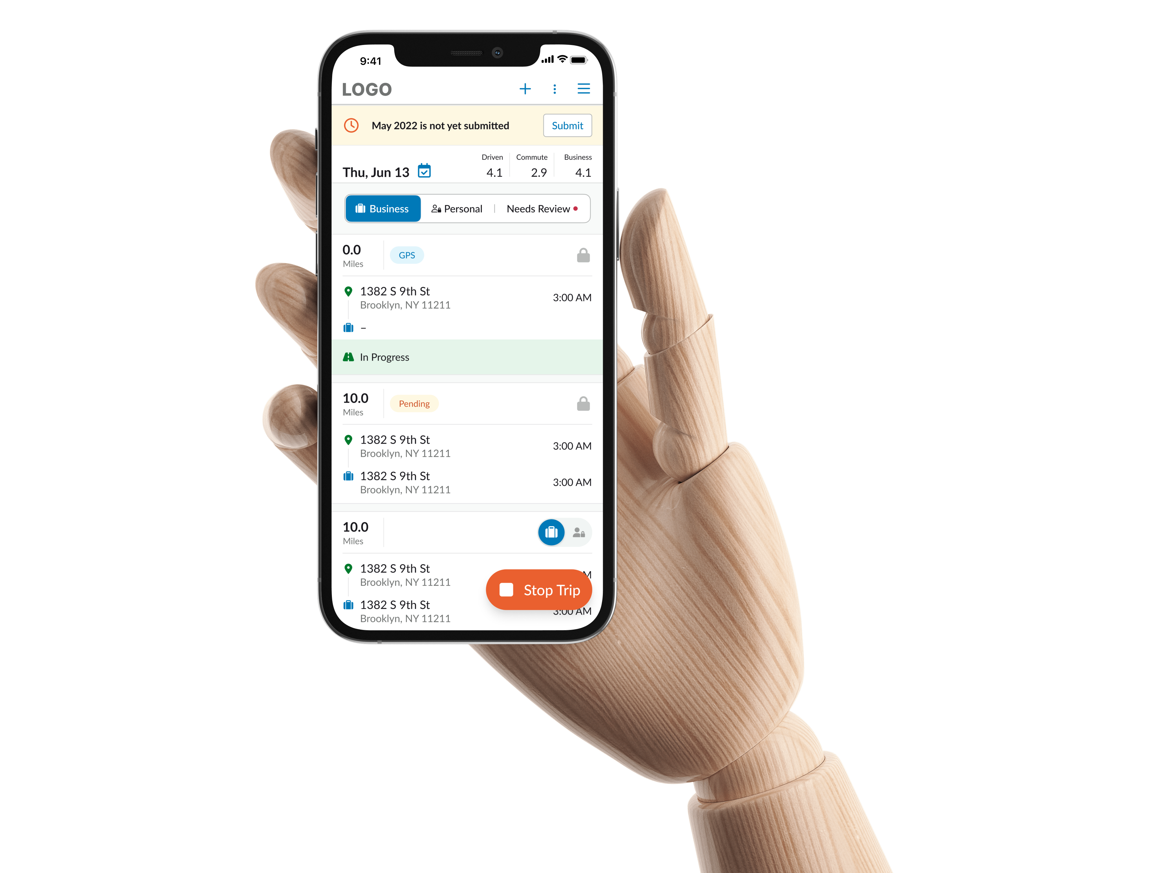
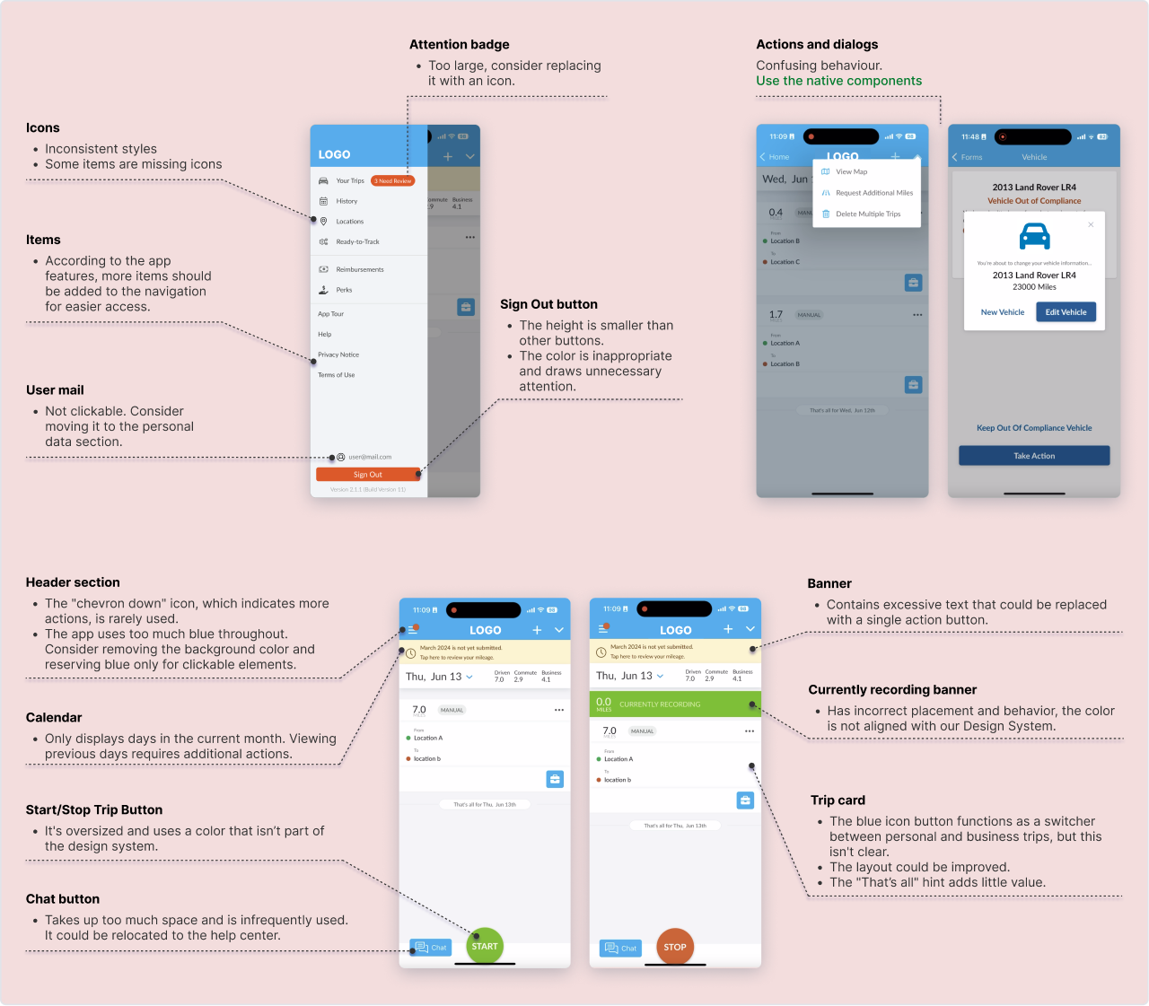
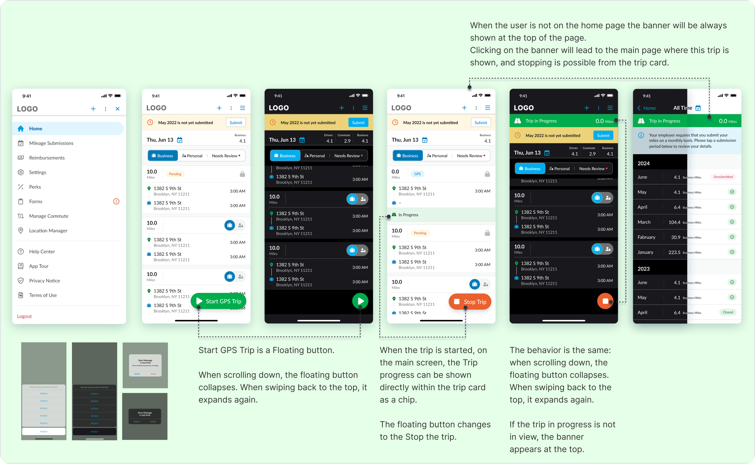
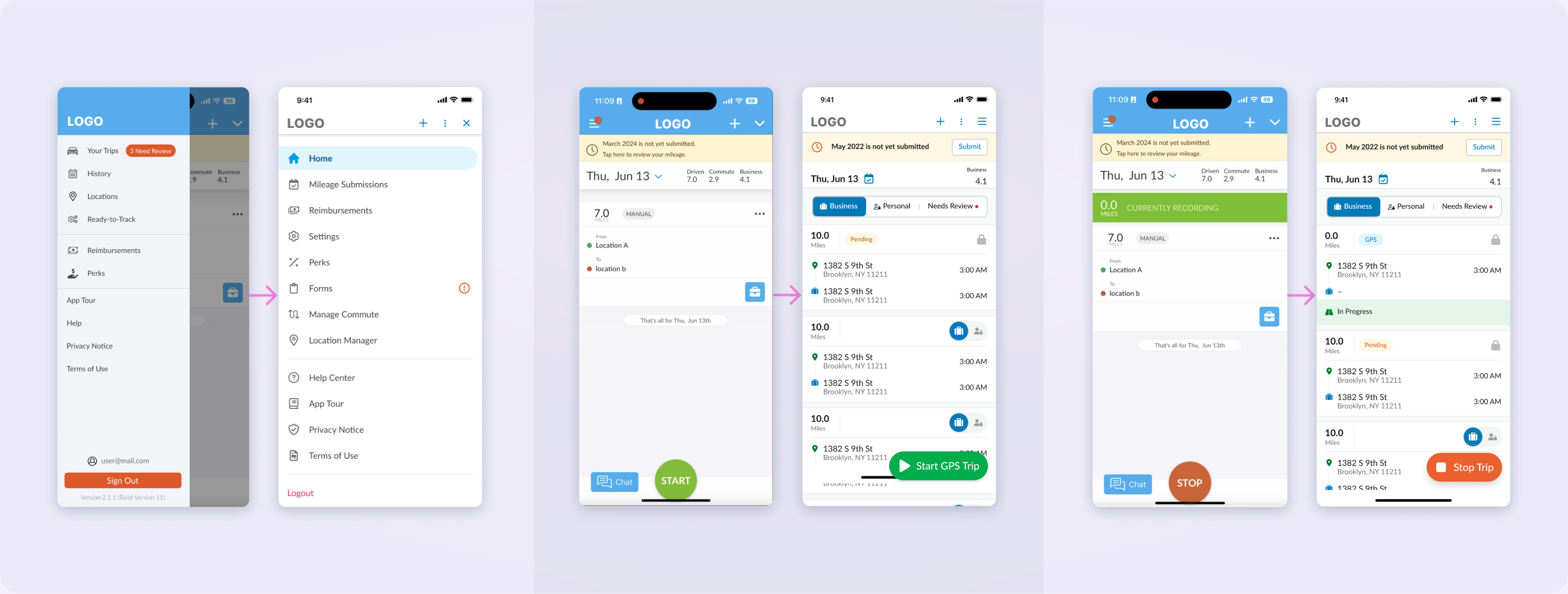
The mobile application suffered from inconsistent components, duplicated interaction patterns, and several usability issues that reduced efficiency.
Instead of redesigning screens individually, I established shared interaction principles, standardized reusable components, and simplified key user flows.
Design Decisions:
- Simplified navigation hierarchy
- Standardized dialogs and interactions
- Improved visual hierarchy
- Reduced unnecessary UI elements
- Enhanced trip management workflow
- Introduced reusable mobile components

Current Experience Audit
Redesigned Experience
Before & After
07/
WEB PLATFORM
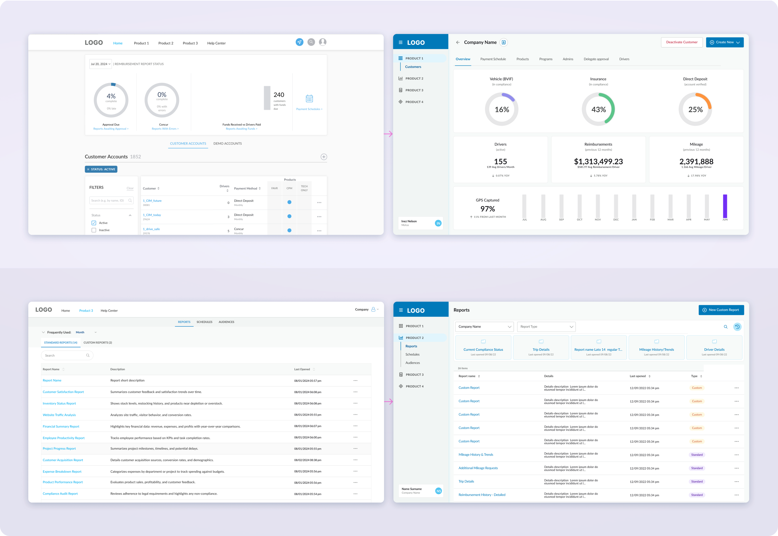
Unifying the Web Platform
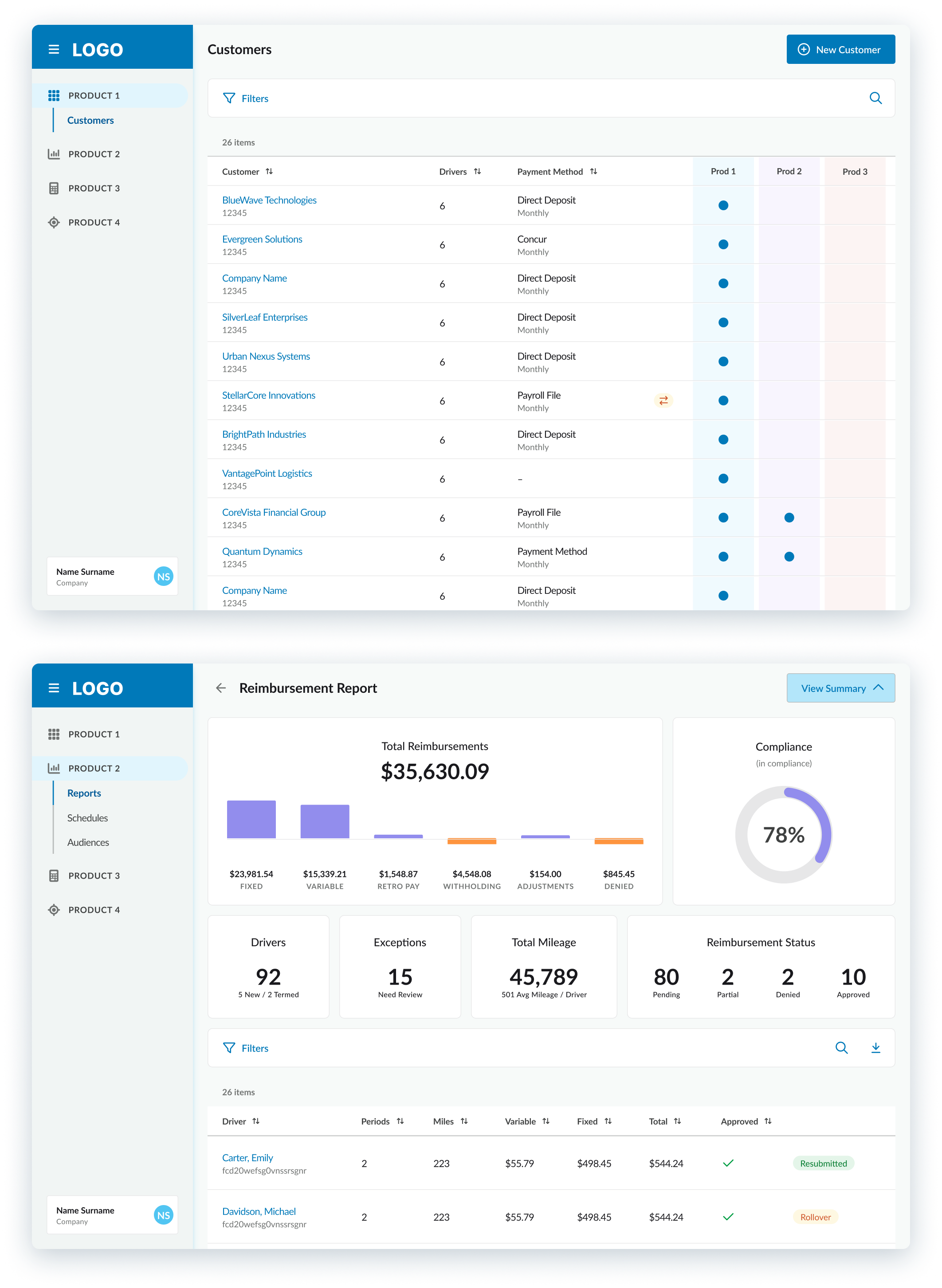
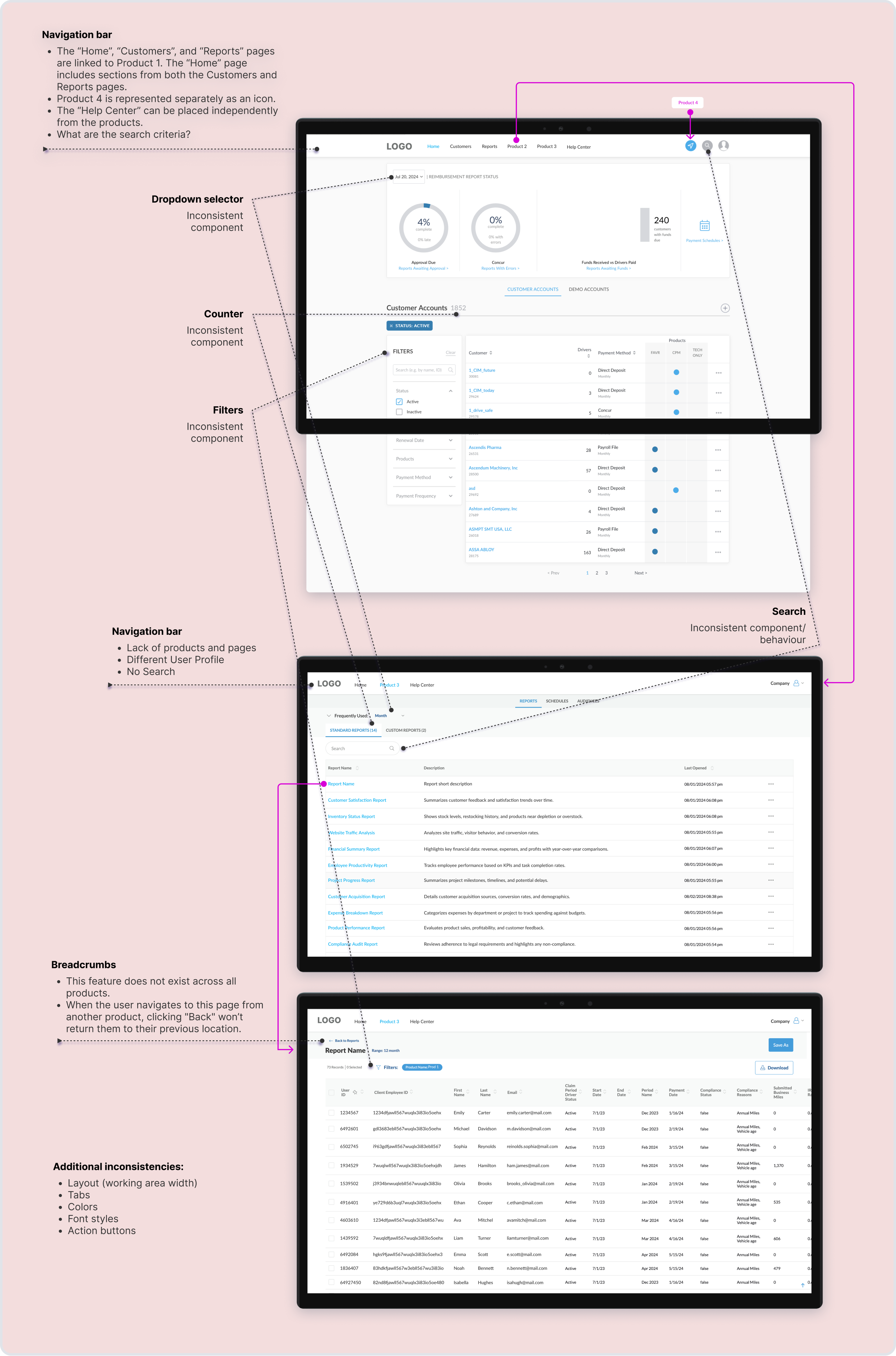
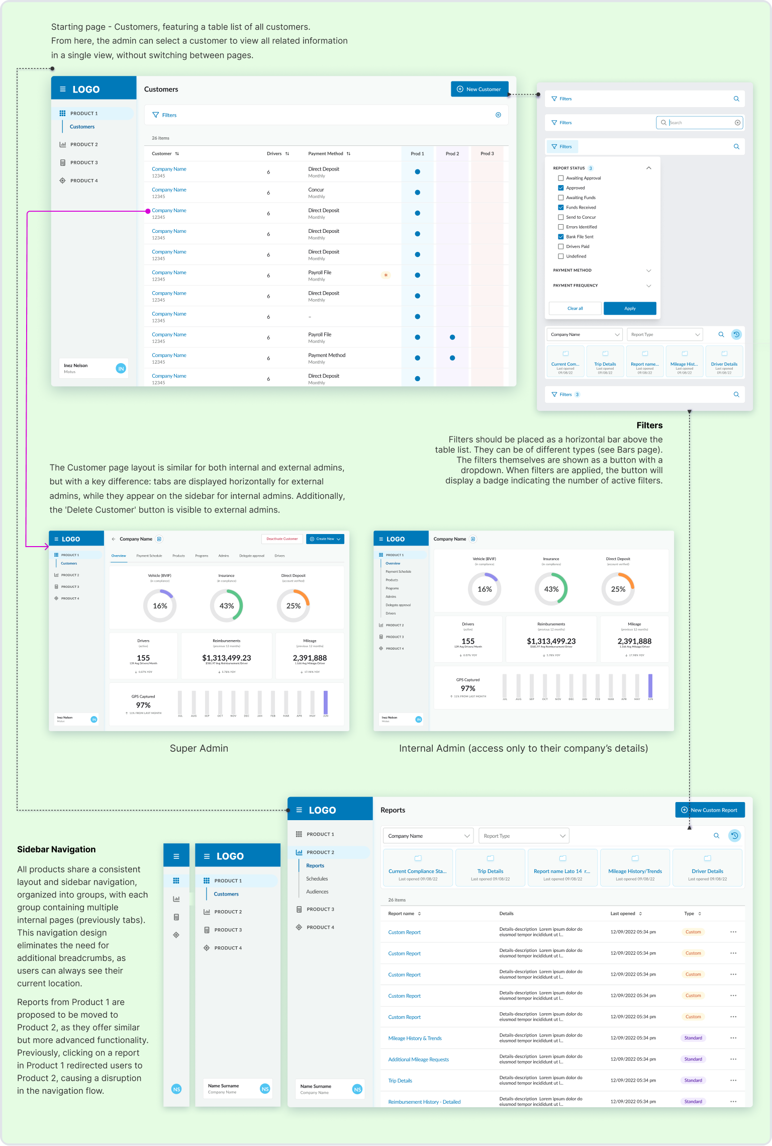
Each web product had evolved separately, resulting in different navigation systems, layouts, components, and interaction models.
Rather than treating each product independently, I redesigned the ecosystem as a single connected platform with consistent navigation, reusable components, and shared interaction patterns.
Design Decisions:
- Unified navigation across all products
- Redesigned customer management workflow
- Standardized tables, filters, and forms
- Improved information architecture
- Reduced duplicated UI patterns
- Created consistent interaction behavior
Current Experience Audit
Redesigned Experience
Before & After
08/
DESIGN SYSTEM
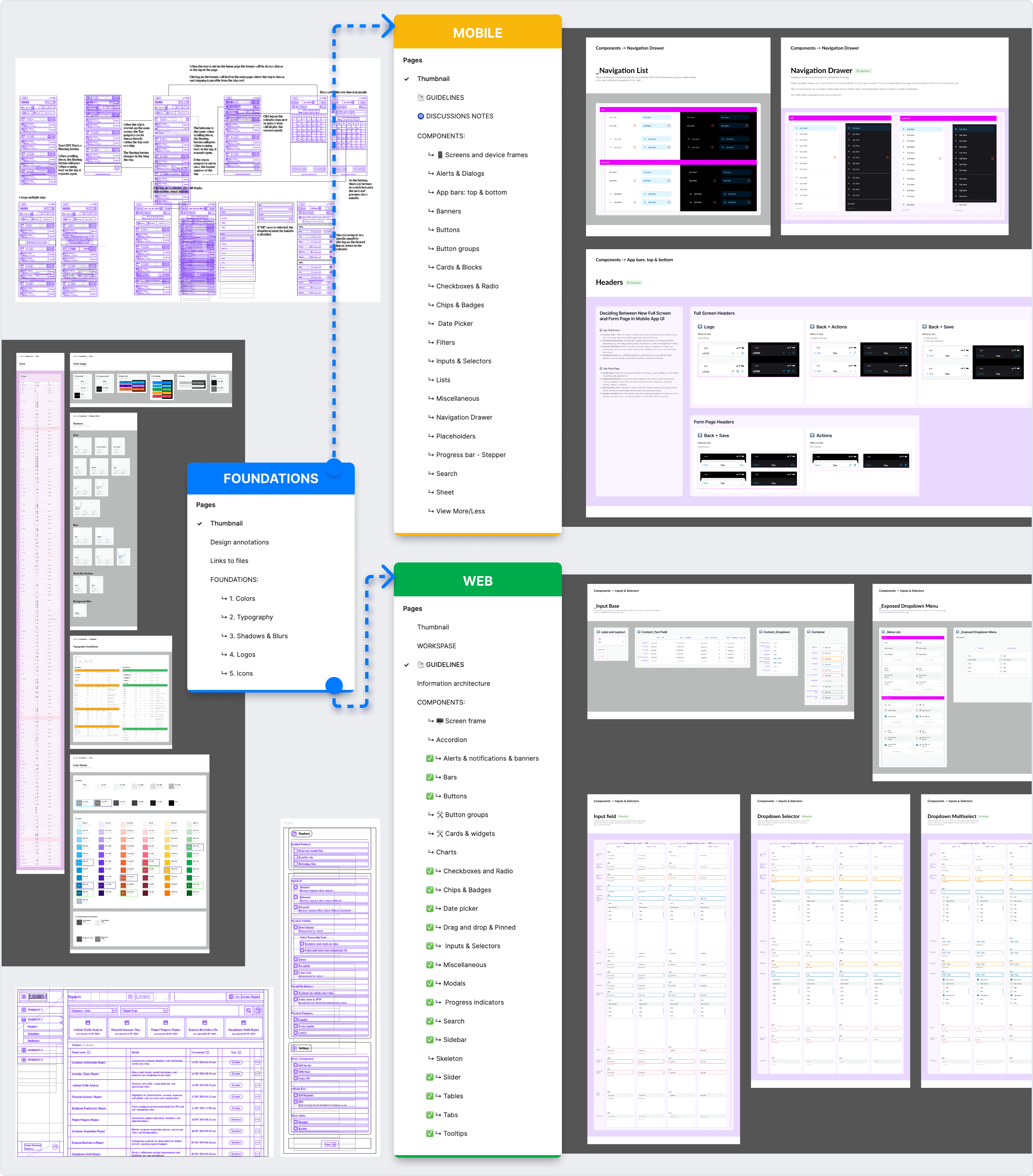
Building a Scalable Design System
To ensure long-term consistency, I developed a modular design system structured into three connected libraries.
The Foundation library centralized shared design tokens, typography, icons, colors, and effects, while dedicated Web and Mobile libraries extended these foundations with platform-specific components.
This structure enabled teams to build faster while maintaining consistency across the entire ecosystem.
09/
Results
Project Outcomes
The redesign established a unified product ecosystem that improved consistency, simplified navigation, and created a scalable foundation for future product development.
Unified Experience
01
Established consistent interaction patterns and visual language across mobile and web products.
Improved Navigation
02
Simplified user journeys by introducing a shared navigation model and clearer information architecture.
Scalable Design System
03
Delivered three interconnected design libraries that streamlined future design and development.
Better Cross-Team Collaboration
04
Created a shared design foundation that improved communication between designers, developers, and stakeholders.
“I just want to give Alona a glowing recommendation. Her work through the design system is remarkable. She has created the architecture view, organized files, outlined where UX needs to focus to improve workflows and given strong debate for UI consistency across the product line. She has accomplished what I needed in a very short amount of time.”

Thorsten Thater,
Engineering Manager at Sehner


Previous Project
Back Office for Public Transport
Next Project
Archive (2019-2022)

© 2026 Tseux. All rights reserved. Made with intent.
Unifying a Multi-Product Ecosystem
Redesigned a fragmented enterprise platform by unifying four independently developed products through shared navigation, scalable design systems, and consistent interaction patterns.
Back to All Works
Scope
Enterprise Product Design · Design System
Platform
Web & Mobile Application
Timeline
3 months
YEAR
2024

01/
NDA restrictions
Confidentiality Notice
This case study has been adapted to comply with a Non-Disclosure Agreement (NDA). Branding has been anonymized, sensitive information has been removed, and selected project details have been modified.
To protect confidential materials, the design process is presented at a high level while accurately reflecting my responsibilities, design decisions, and overall methodology.
The purpose of this case study is to demonstrate my approach to solving complex product challenges and delivering scalable solutions within tight project timelines.
02/
Background
Project Context & My Role
The company provides a workforce management platform that helps organizations manage mobile employees, reimbursements, compliance, and reporting through multiple connected products.
Over time, each product had evolved independently, resulting in inconsistent navigation, duplicated interaction patterns, and fragmented user experiences. Users frequently switched between products but were forced to relearn the interface each time.
I joined the project to evaluate the existing ecosystem, identify usability issues, and establish a unified experience across web and mobile while creating scalable design systems for future product growth.
During this three-month engagement, I was responsible for:
- Auditing the existing product ecosystem
- Conducting UX research and usability evaluations
- Redesigning key user journeys
- Improving information architecture
- Creating mobile and web design systems
- Collaborating with stakeholders and developers throughout implementation
03/
Problem
The Challenge
Redesigning individual screens wasn't the biggest challenge.
The real challenge was creating a consistent experience across multiple independently developed products without disrupting existing workflows or slowing down product delivery.
Within a limited timeframe, the solution needed to improve usability while providing a scalable foundation for future development.
Inconsistent Product Experience
01

Each product introduced different navigation models, interaction patterns, and visual styles, forcing users to repeatedly adapt.
Fragmented Navigation
02
Moving between products disrupted users' mental model, making common tasks slower and more confusing.
Limited Timeline
03
The ecosystem assessment, redesign, and design system creation all needed to be completed within only three months.
Scalable Foundation
04
The solution needed to support future product development across both web and mobile platforms while maintaining consistency.
04/
Approach
Design Process
Rather than redesigning individual interfaces, I approached the project as a product ecosystem.
The process began with understanding user workflows and identifying inconsistencies across products before defining a shared design language, restructuring navigation, and creating reusable systems that could scale across future releases.
DISCOVER
Stakeholder alignment
||
Product audit
||
User interviews
||
Usability evaluation
||

DEFINE
Problem prioritization
||
Information Architecture
||
Navigation strategy
||
Design principles
||

DEVELOP
Mobile redesign
||
Web redesign
||
Component standardization
||
Design system creation
||
DELIVER
Documentation
||
Design system handoff
||
Stakeholder validation
||
Future recommendations
||
05/
DISCOVERY
Understanding Users & Products
Research focused on understanding user behavior, identifying recurring usability issues, and mapping inconsistencies across the product ecosystem before defining design priorities.
Research combined stakeholder interviews, usability testing, and product audits to uncover recurring usability issues shared across multiple products.
User Interviews
Usability Testing
Primary focus
Discover needs, frustrations
Observe real users interacting with prototypes or products. Task: Review various statistics and reports for three different users.
Methodology
Conduct and record remote interviews, synthesize themes
Record sessions, note behaviors and ease of task completion
Key Metrics
6 internal users from different departments
- Task Success Rate
- Time on Task
- Bug Volume
Tools
Video calls, Google Forms
Hotjar - heat mapping, screen recordings. Live sessions
I often got confused when switching between the main product and the one with statistics. It wasn’t clear how to go back, and I kept getting lost. Some buttons and menus also looked different in each product, which made things more confusing. It slowed me down and made using the system harder that it needed to be
Emily
Business Analyst
06/
MOBILE EXPERIENCE
Creating a Consistent Mobile Experience
The mobile application suffered from inconsistent components, duplicated interaction patterns, and several usability issues that reduced efficiency.
Instead of redesigning screens individually, I established shared interaction principles, standardized reusable components, and simplified key user flows.
Design Decisions:
- Simplified navigation hierarchy
- Standardized dialogs and interactions
- Improved visual hierarchy
- Reduced unnecessary UI elements
- Enhanced trip management workflow
- Introduced reusable mobile components

Current Experience Audit
Redesigned Experience
Before & After
07/
WEB PLATFORM
Unifying the Web Platform
Each web product had evolved separately, resulting in different navigation systems, layouts, components, and interaction models.
Rather than treating each product independently, I redesigned the ecosystem as a single connected platform with consistent navigation, reusable components, and shared interaction patterns.
Design Decisions:
- Unified navigation across all products
- Redesigned customer management workflow
- Standardized tables, filters, and forms
- Improved information architecture
- Reduced duplicated UI patterns
- Created consistent interaction behavior
Current Experience Audit
Redesigned Experience
Before & After
08/
DESIGN SYSTEM
Building a Scalable Design System
To ensure long-term consistency, I developed a modular design system structured into three connected libraries.
The Foundation library centralized shared design tokens, typography, icons, colors, and effects, while dedicated Web and Mobile libraries extended these foundations with platform-specific components.
This structure enabled teams to build faster while maintaining consistency across the entire ecosystem.
09/
Results
Project Outcomes
The redesign established a unified product ecosystem that improved consistency, simplified navigation, and created a scalable foundation for future product development.
Unified Experience
01

Established consistent interaction patterns and visual language across mobile and web products.
Improved Navigation
02
Simplified user journeys by introducing a shared navigation model and clearer information architecture.
Scalable Design System
03
Delivered three interconnected design libraries that streamlined future design and development.
Better Cross-Team Collaboration
04
Created a shared design foundation that improved communication between designers, developers, and stakeholders.
“I just want to give Alona a glowing recommendation. Her work through the design system is remarkable. She has created the architecture view, organized files, outlined where UX needs to focus to improve workflows and given strong debate for UI consistency across the product line. She has accomplished what I needed in a very short amount of time.”
Thorsten Thater,
Engineering Manager at Sehner
Previous Project
Back Office for Public Transport
Next Project
Archive (2019-2022)
© 2026 Tseux. All rights reserved. Made with intent.
Unifying a Multi-Product Ecosystem
Redesigned a fragmented enterprise platform by unifying four independently developed products through shared navigation, scalable design systems, and consistent interaction patterns.
Back to All Works
Scope
Enterprise Product Design · Design System
Platform
Web & Mobile Application
Timeline
3 months
YEAR
2024

01/
NDA restrictions
Confidentiality Notice
This case study has been adapted to comply with a Non-Disclosure Agreement (NDA). Branding has been anonymized, sensitive information has been removed, and selected project details have been modified.
To protect confidential materials, the design process is presented at a high level while accurately reflecting my responsibilities, design decisions, and overall methodology.
The purpose of this case study is to demonstrate my approach to solving complex product challenges and delivering scalable solutions within tight project timelines.
02/
Background
Project Context & My Role
The company provides a workforce management platform that helps organizations manage mobile employees, reimbursements, compliance, and reporting through multiple connected products.
Over time, each product had evolved independently, resulting in inconsistent navigation, duplicated interaction patterns, and fragmented user experiences. Users frequently switched between products but were forced to relearn the interface each time.
I joined the project to evaluate the existing ecosystem, identify usability issues, and establish a unified experience across web and mobile while creating scalable design systems for future product growth.
During this three-month engagement, I was responsible for:
- Auditing the existing product ecosystem
- Conducting UX research and usability evaluations
- Redesigning key user journeys
- Improving information architecture
- Creating mobile and web design systems
- Collaborating with stakeholders and developers throughout implementation
03/
Problem
The Challenge
Redesigning individual screens wasn't the biggest challenge.
The real challenge was creating a consistent experience across multiple independently developed products without disrupting existing workflows or slowing down product delivery.
Within a limited timeframe, the solution needed to improve usability while providing a scalable foundation for future development.
Inconsistent Product Experience
01

Each product introduced different navigation models, interaction patterns, and visual styles, forcing users to repeatedly adapt.
Fragmented Navigation
02
Moving between products disrupted users' mental model, making common tasks slower and more confusing.
Limited Timeline
03
The ecosystem assessment, redesign, and design system creation all needed to be completed within only three months.
Scalable Foundation
04
The solution needed to support future product development across both web and mobile platforms while maintaining consistency.
04/
Approach
Design Process
Rather than redesigning individual interfaces, I approached the project as a product ecosystem.
The process began with understanding user workflows and identifying inconsistencies across products before defining a shared design language, restructuring navigation, and creating reusable systems that could scale across future releases.
DISCOVER
DEFINE
DEVELOP
DELIVER

Stakeholder alignment
||
Product audit
||
User interviews
||
Usability evaluation
||
Problem prioritization
||
Information Architecture
||
Navigation strategy
||
Design principles
||
Mobile redesign
||
Web redesign
||
Component standardization
||
Design system creation
||
Documentation
||
Design system handoff
||
Stakeholder validation
||
Future recommendations
||

05/
DISCOVERY
Understanding Users & Products
Research focused on understanding user behavior, identifying recurring usability issues, and mapping inconsistencies across the product ecosystem before defining design priorities.
Research combined stakeholder interviews, usability testing, and product audits to uncover recurring usability issues shared across multiple products.
User Interviews
Usability Testing
Primary focus
Discover needs, frustrations
Observe real users interacting with prototypes or products. Task: Review various statistics and reports for three different users.
Methodology
Conduct and record remote interviews, synthesize themes
Record sessions, note behaviors and ease of task completion
Key Metrics
6 internal users from different departments
- Task Success Rate
- Time on Task
- Bug Volume
Tools
Video calls, Google Forms
Hotjar - heat mapping, screen recordings. Live sessions
I often got confused when switching between the main product and the one with statistics. It wasn’t clear how to go back, and I kept getting lost. Some buttons and menus also looked different in each product, which made things more confusing. It slowed me down and made using the system harder that it needed to be
Emily
Business Analyst
06/
MOBILE EXPERIENCE
Creating a Consistent Mobile Experience
The mobile application suffered from inconsistent components, duplicated interaction patterns, and several usability issues that reduced efficiency.
Instead of redesigning screens individually, I established shared interaction principles, standardized reusable components, and simplified key user flows.
Design Decisions:
- Simplified navigation hierarchy
- Standardized dialogs and interactions
- Improved visual hierarchy
- Reduced unnecessary UI elements
- Enhanced trip management workflow
- Introduced reusable mobile components
Current Experience Audit
Redesigned Experience
Before & After
07/
WEB PLATFORM
Unifying the Web Platform
Each web product had evolved separately, resulting in different navigation systems, layouts, components, and interaction models.
Rather than treating each product independently, I redesigned the ecosystem as a single connected platform with consistent navigation, reusable components, and shared interaction patterns.
Design Decisions:
- Unified navigation across all products
- Redesigned customer management workflow
- Standardized tables, filters, and forms
- Improved information architecture
- Reduced duplicated UI patterns
- Created consistent interaction behavior
Current Experience Audit
Redesigned Experience
Before & After
08/
DESIGN SYSTEM
Building a Scalable Design System
To ensure long-term consistency, I developed a modular design system structured into three connected libraries.
The Foundation library centralized shared design tokens, typography, icons, colors, and effects, while dedicated Web and Mobile libraries extended these foundations with platform-specific components.
This structure enabled teams to build faster while maintaining consistency across the entire ecosystem.
09/
Results
Project Outcomes
The redesign established a unified product ecosystem that improved consistency, simplified navigation, and created a scalable foundation for future product development.
Unified Experience
01
Established consistent interaction patterns and visual language across mobile and web products.
Improved Navigation
02
Simplified user journeys by introducing a shared navigation model and clearer information architecture.
Scalable Design System
03
Delivered three interconnected design libraries that streamlined future design and development.
Better Cross-Team Collaboration
04
Created a shared design foundation that improved communication between designers, developers, and stakeholders.
“I just want to give Alona a glowing recommendation. Her work through the design system is remarkable. She has created the architecture view, organized files, outlined where UX needs to focus to improve workflows and given strong debate for UI consistency across the product line. She has accomplished what I needed in a very short amount of time.”
anne, customer’s Director of User Experience
Previous Project
Back Office for Public Transport
Next Project
Archive (2019-2022)
© 2026 Tseux. All rights reserved. Made with intent.
Unifying
a Multi-Product Ecosystem
Redesigned a fragmented enterprise platform by unifying four independently developed products through shared navigation, scalable design systems, and consistent interaction patterns.
Back to All Works
Scope
Enterprise Product Design · Design System
Platform
Web & Mobile Application
Timeline
3 months
YEAR
2024

01/
NDA restrictions
Confidentiality Notice
This case study has been adapted to comply with a Non-Disclosure Agreement (NDA). Branding has been anonymized, sensitive information has been removed, and selected project details have been modified.
To protect confidential materials, the design process is presented at a high level while accurately reflecting my responsibilities, design decisions, and overall methodology.
The purpose of this case study is to demonstrate my approach to solving complex product challenges and delivering scalable solutions within tight project timelines.
02/
Background
Project Context & My Role
The company provides a workforce management platform that helps organizations manage mobile employees, reimbursements, compliance, and reporting through multiple connected products.
Over time, each product had evolved independently, resulting in inconsistent navigation, duplicated interaction patterns, and fragmented user experiences. Users frequently switched between products but were forced to relearn the interface each time.
I joined the project to evaluate the existing ecosystem, identify usability issues, and establish a unified experience across web and mobile while creating scalable design systems for future product growth.
During this three-month engagement, I was responsible for:
- Auditing the existing product ecosystem
- Conducting UX research and usability evaluations
- Redesigning key user journeys
- Improving information architecture
- Creating mobile and web design systems
- Collaborating with stakeholders and developers throughout implementation
03/
Problem
The Challenge
Redesigning individual screens wasn't the biggest challenge.
The real challenge was creating a consistent experience across multiple independently developed products without disrupting existing workflows or slowing down product delivery.
Within a limited timeframe, the solution needed to improve usability while providing a scalable foundation for future development.
Inconsistent Product Experience
01

Each product introduced different navigation models, interaction patterns, and visual styles, forcing users to repeatedly adapt.
Fragmented Navigation
02
Moving between products disrupted users' mental model, making common tasks slower and more confusing.
Limited Timeline
03
The ecosystem assessment, redesign, and design system creation all needed to be completed within only three months.
Scalable Foundation
04
The solution needed to support future product development across both web and mobile platforms while maintaining consistency.
04/
Approach
Design Process
Rather than redesigning individual interfaces, I approached the project as a product ecosystem.
The process began with understanding user workflows and identifying inconsistencies across products before defining a shared design language, restructuring navigation, and creating reusable systems that could scale across future releases.
DISCOVER
DEFINE
DEVELOP
DELIVER

Stakeholder alignment
||
Product audit
||
User interviews
||
Usability evaluation
||
Problem prioritization
||
Information Architecture
||
Navigation strategy
||
Design principles
||
Mobile redesign
||
Web redesign
||
Component standardization
||
Design system creation
||
Documentation
||
Design system handoff
||
Stakeholder validation
||
Future recommendations
||
05/
DISCOVERY
Understanding Users & Products
Research focused on understanding user behavior, identifying recurring usability issues, and mapping inconsistencies across the product ecosystem before defining design priorities.
Research combined stakeholder interviews, usability testing, and product audits to uncover recurring usability issues shared across multiple products.
User Interviews
Usability Testing
Primary focus
Discover needs, frustrations
Observe real users interacting with prototypes or products. Task: Review various statistics and reports for three different users.
Methodology
Conduct and record remote interviews, synthesize themes
Record sessions, note behaviors and ease of task completion
Key Metrics
6 internal users from different departments
- Task Success Rate
- Time on Task
- Bug Volume
Tools
Video calls, Google Forms
Hotjar - heat mapping, screen recordings. Live sessions
I often got confused when switching between the main product and the one with statistics. It wasn’t clear how to go back, and I kept getting lost. Some buttons and menus also looked different in each product, which made things more confusing. It slowed me down and made using the system harder that it needed to be
Emily
Business Analyst
06/
MOBILE EXPERIENCE
Creating a Consistent Mobile Experience
The mobile application suffered from inconsistent components, duplicated interaction patterns, and several usability issues that reduced efficiency.
Instead of redesigning screens individually, I established shared interaction principles, standardized reusable components, and simplified key user flows.
Design Decisions:
- Simplified navigation hierarchy
- Standardized dialogs and interactions
- Improved visual hierarchy
- Reduced unnecessary UI elements
- Enhanced trip management workflow
- Introduced reusable mobile components

Current Experience Audit
Redesigned Experience
Before & After
07/
WEB PLATFORM
Unifying the Web Platform
Each web product had evolved separately, resulting in different navigation systems, layouts, components, and interaction models.
Rather than treating each product independently, I redesigned the ecosystem as a single connected platform with consistent navigation, reusable components, and shared interaction patterns.
Design Decisions:
- Unified navigation across all products
- Redesigned customer management workflow
- Standardized tables, filters, and forms
- Improved information architecture
- Reduced duplicated UI patterns
- Created consistent interaction behavior
Current Experience Audit
Redesigned Experience
Before & After
08/
DESIGN SYSTEM
Building a Scalable Design System
To ensure long-term consistency, I developed a modular design system structured into three connected libraries.
The Foundation library centralized shared design tokens, typography, icons, colors, and effects, while dedicated Web and Mobile libraries extended these foundations with platform-specific components.
This structure enabled teams to build faster while maintaining consistency across the entire ecosystem.
09/
Results
Project Outcomes
The redesign established a unified product ecosystem that improved consistency, simplified navigation, and created a scalable foundation for future product development.
Unified Experience
01
Established consistent interaction patterns and visual language across mobile and web products.
Improved Navigation
02
Simplified user journeys by introducing a shared navigation model and clearer information architecture.
Scalable Design System
03
Delivered three interconnected design libraries that streamlined future design and development.
Better Cross-Team Collaboration
04
Created a shared design foundation that improved communication between designers, developers, and stakeholders.
“I just want to give Alona a glowing recommendation. Her work through the design system is remarkable. She has created the architecture view, organized files, outlined where UX needs to focus to improve workflows and given strong debate for UI consistency across the product line. She has accomplished what I needed in a very short amount of time.”
anne, customer’s Director of User Experience
Previous Project
Back Office for Public Transport
Next Project
Archive (2019-2022)
© 2026 Tseux. All rights reserved. Made with intent.
Unifying
a Multi-Product Ecosystem
Redesigned a fragmented enterprise platform by unifying four independently developed products through shared navigation, scalable design systems, and consistent interaction patterns.
Back to All Works
Scope
Enterprise Product Design · Design System
Platform
Web & Mobile Application
Timeline
3 months
YEAR
2024

01/
NDA restrictions
Confidentiality Notice
This case study has been adapted to comply with a Non-Disclosure Agreement (NDA). Branding has been anonymized, sensitive information has been removed, and selected project details have been modified.
To protect confidential materials, the design process is presented at a high level while accurately reflecting my responsibilities, design decisions, and overall methodology.
The purpose of this case study is to demonstrate my approach to solving complex product challenges and delivering scalable solutions within tight project timelines.
02/
Background
Project Context & My Role
The company provides a workforce management platform that helps organizations manage mobile employees, reimbursements, compliance, and reporting through multiple connected products.
Over time, each product had evolved independently, resulting in inconsistent navigation, duplicated interaction patterns, and fragmented user experiences. Users frequently switched between products but were forced to relearn the interface each time.
I joined the project to evaluate the existing ecosystem, identify usability issues, and establish a unified experience across web and mobile while creating scalable design systems for future product growth.
During this three-month engagement, I was responsible for:
- Auditing the existing product ecosystem
- Conducting UX research and usability evaluations
- Redesigning key user journeys
- Improving information architecture
- Creating mobile and web design systems
- Collaborating with stakeholders and developers throughout implementation
03/
Problem
The Challenge
Redesigning individual screens wasn't the biggest challenge.
The real challenge was creating a consistent experience across multiple independently developed products without disrupting existing workflows or slowing down product delivery.
Within a limited timeframe, the solution needed to improve usability while providing a scalable foundation for future development.
Inconsistent Product Experience
01

Each product introduced different navigation models, interaction patterns, and visual styles, forcing users to repeatedly adapt.
Fragmented Navigation
02
Moving between products disrupted users' mental model, making common tasks slower and more confusing.
Limited Timeline
03
The ecosystem assessment, redesign, and design system creation all needed to be completed within only three months.
Scalable Foundation
04
The solution needed to support future product development across both web and mobile platforms while maintaining consistency.
04/
Approach
Design Process
Rather than redesigning individual interfaces, I approached the project as a product ecosystem.
The process began with understanding user workflows and identifying inconsistencies across products before defining a shared design language, restructuring navigation, and creating reusable systems that could scale across future releases.
DISCOVER
DEFINE
DEVELOP
DELIVER
Stakeholder alignment
||
Product audit
||
User interviews
||
Usability evaluation
||
Problem prioritization
||
Information Architecture
||
Navigation strategy
||
Design principles
||
Mobile redesign
||
Web redesign
||
Component standardization
||
Design system creation
||
Documentation
||
Design system handoff
||
Stakeholder validation
||
Future recommendations
||
05/
DISCOVERY
Understanding Users & Products
Research focused on understanding user behavior, identifying recurring usability issues, and mapping inconsistencies across the product ecosystem before defining design priorities.
Research combined stakeholder interviews, usability testing, and product audits to uncover recurring usability issues shared across multiple products.
User Interviews
Usability Testing
Primary focus
Discover needs, frustrations
Observe real users interacting with prototypes or products. Task: Review various statistics and reports for three different users.
Methodology
Conduct and record remote interviews, synthesize themes
Record sessions, note behaviors and ease of task completion
Key Metrics
6 internal users from different departments
- Task Success Rate
- Time on Task
- Bug Volume
Tools
Video calls, Google Forms
Hotjar - heat mapping, screen recordings. Live sessions
I often got confused when switching between the main product and the one with statistics. It wasn’t clear how to go back, and I kept getting lost. Some buttons and menus also looked different in each product, which made things more confusing. It slowed me down and made using the system harder that it needed to be
Emily
Business Analyst
06/
MOBILE EXPERIENCE
Creating a Consistent Mobile Experience
The mobile application suffered from inconsistent components, duplicated interaction patterns, and several usability issues that reduced efficiency.
Instead of redesigning screens individually, I established shared interaction principles, standardized reusable components, and simplified key user flows.
Design Decisions:
- Simplified navigation hierarchy
- Standardized dialogs and interactions
- Improved visual hierarchy
- Reduced unnecessary UI elements
- Enhanced trip management workflow
- Introduced reusable mobile components
Current Experience Audit
Redesigned Experience
Before & After
07/
WEB PLATFORM
Unifying the Web Platform
Each web product had evolved separately, resulting in different navigation systems, layouts, components, and interaction models.
Rather than treating each product independently, I redesigned the ecosystem as a single connected platform with consistent navigation, reusable components, and shared interaction patterns.
Design Decisions:
- Unified navigation across all products
- Redesigned customer management workflow
- Standardized tables, filters, and forms
- Improved information architecture
- Reduced duplicated UI patterns
- Created consistent interaction behavior
Current Experience Audit
Redesigned Experience
Before & After
08/
DESIGN SYSTEM
Building a Scalable Design System
To ensure long-term consistency, I developed a modular design system structured into three connected libraries.
The Foundation library centralized shared design tokens, typography, icons, colors, and effects, while dedicated Web and Mobile libraries extended these foundations with platform-specific components.
This structure enabled teams to build faster while maintaining consistency across the entire ecosystem.
09/
Results
Project Outcomes
The redesign established a unified product ecosystem that improved consistency, simplified navigation, and created a scalable foundation for future product development.
Unified Experience
01

Established consistent interaction patterns and visual language across mobile and web products.
Improved Navigation
02
Simplified user journeys by introducing a shared navigation model and clearer information architecture.
Scalable Design System
03
Delivered three interconnected design libraries that streamlined future design and development.
Better Cross-Team Collaboration
04
Created a shared design foundation that improved communication between designers, developers, and stakeholders.
“I just want to give Alona a glowing recommendation. Her work through the design system is remarkable. She has created the architecture view, organized files, outlined where UX needs to focus to improve workflows and given strong debate for UI consistency across the product line. She has accomplished what I needed in a very short amount of time.”
anne, customer’s Director of User Experience
Previous Project
Back Office for Public Transport
Next Project
Archive (2019-2022)
© 2026 Tseux. All rights reserved. Made with intent.
Unifying
a Multi-Product Ecosystem
Redesigned a fragmented enterprise platform by unifying four independently developed products through shared navigation, scalable design systems, and consistent interaction patterns.
Back to All Works
Scope
Enterprise Product Design · Design System
Platform
Web & Mobile Application
Timeline
3 months
YEAR
2024

01/
NDA restrictions
Confidentiality Notice
This case study has been adapted to comply with a Non-Disclosure Agreement (NDA). Branding has been anonymized, sensitive information has been removed, and selected project details have been modified.
To protect confidential materials, the design process is presented at a high level while accurately reflecting my responsibilities, design decisions, and overall methodology.
The purpose of this case study is to demonstrate my approach to solving complex product challenges and delivering scalable solutions within tight project timelines.
02/
Background
Project Context & My Role
The company provides a workforce management platform that helps organizations manage mobile employees, reimbursements, compliance, and reporting through multiple connected products.
Over time, each product had evolved independently, resulting in inconsistent navigation, duplicated interaction patterns, and fragmented user experiences. Users frequently switched between products but were forced to relearn the interface each time.
I joined the project to evaluate the existing ecosystem, identify usability issues, and establish a unified experience across web and mobile while creating scalable design systems for future product growth.
During this three-month engagement, I was responsible for:
- Auditing the existing product ecosystem
- Conducting UX research and usability evaluations
- Redesigning key user journeys
- Improving information architecture
- Creating mobile and web design systems
- Collaborating with stakeholders and developers throughout implementation
03/
Problem
The Challenge
Redesigning individual screens wasn't the biggest challenge.
The real challenge was creating a consistent experience across multiple independently developed products without disrupting existing workflows or slowing down product delivery.
Within a limited timeframe, the solution needed to improve usability while providing a scalable foundation for future development.
Inconsistent Product Experience
01

Each product introduced different navigation models, interaction patterns, and visual styles, forcing users to repeatedly adapt.
Fragmented Navigation
02

Moving between products disrupted users' mental model, making common tasks slower and more confusing.
Limited Timeline
03

The ecosystem assessment, redesign, and design system creation all needed to be completed within only three months.
Scalable Foundation
04
The solution needed to support future product development across both web and mobile platforms while maintaining consistency.
04/
Approach
Design Process
Rather than redesigning individual interfaces, I approached the project as a product ecosystem.
The process began with understanding user workflows and identifying inconsistencies across products before defining a shared design language, restructuring navigation, and creating reusable systems that could scale across future releases.
DISCOVER
DEFINE
DEVELOP
DELIVER
Stakeholder alignment
||
Product audit
||
User interviews
||
Usability evaluation
||
Problem prioritization
||
Information Architecture
||
Navigation strategy
||
Design principles
||
Mobile redesign
||
Web redesign
||
Component standardization
||
Design system creation
||
Documentation
||
Design system handoff
||
Stakeholder validation
||
Future recommendations
||
05/
DISCOVERY
Understanding Users & Products
Research focused on understanding user behavior, identifying recurring usability issues, and mapping inconsistencies across the product ecosystem before defining design priorities.
Research combined stakeholder interviews, usability testing, and product audits to uncover recurring usability issues shared across multiple products.
User Interviews
Usability Testing
Primary focus
Discover needs, frustrations
Observe real users interacting with prototypes or products. Task: Review various statistics and reports for three different users.
Methodology
Conduct and record remote interviews, synthesize themes
Record sessions, note behaviors and ease of task completion
Key Metrics
6 internal users from different departments
- Task Success Rate
- Time on Task
- Bug Volume
Tools
Video calls, Google Forms
Hotjar - heat mapping, screen recordings. Live sessions
I often got confused when switching between the main product and the one with statistics. It wasn’t clear how to go back, and I kept getting lost. Some buttons and menus also looked different in each product, which made things more confusing. It slowed me down and made using the system harder that it needed to be
Emily
Business Analyst
06/
MOBILE EXPERIENCE
Creating a Consistent Mobile Experience
The mobile application suffered from inconsistent components, duplicated interaction patterns, and several usability issues that reduced efficiency.
Instead of redesigning screens individually, I established shared interaction principles, standardized reusable components, and simplified key user flows.
Design Decisions:
- Simplified navigation hierarchy
- Standardized dialogs and interactions
- Improved visual hierarchy
- Reduced unnecessary UI elements
- Enhanced trip management workflow
- Introduced reusable mobile components
Current Experience Audit
Redesigned Experience
Before & After
07/
WEB PLATFORM
Unifying the Web Platform
Each web product had evolved separately, resulting in different navigation systems, layouts, components, and interaction models.
Rather than treating each product independently, I redesigned the ecosystem as a single connected platform with consistent navigation, reusable components, and shared interaction patterns.
Design Decisions:
- Unified navigation across all products
- Redesigned customer management workflow
- Standardized tables, filters, and forms
- Improved information architecture
- Reduced duplicated UI patterns
- Created consistent interaction behavior
Current Experience Audit
Redesigned Experience
Before & After
08/
DESIGN SYSTEM
Building a Scalable Design System
To ensure long-term consistency, I developed a modular design system structured into three connected libraries.
The Foundation library centralized shared design tokens, typography, icons, colors, and effects, while dedicated Web and Mobile libraries extended these foundations with platform-specific components.
This structure enabled teams to build faster while maintaining consistency across the entire ecosystem.
09/
Results
Project Outcomes
The redesign established a unified product ecosystem that improved consistency, simplified navigation, and created a scalable foundation for future product development.
Unified Experience
01

Established consistent interaction patterns and visual language across mobile and web products.
Improved Navigation
02
Simplified user journeys by introducing a shared navigation model and clearer information architecture.
Scalable Design System
03
Delivered three interconnected design libraries that streamlined future design and development.
Better Cross-Team Collaboration
04

Created a shared design foundation that improved communication between designers, developers, and stakeholders.
“I just want to give Alona a glowing recommendation. Her work through the design system is remarkable. She has created the architecture view, organized files, outlined where UX needs to focus to improve workflows and given strong debate for UI consistency across the product line. She has accomplished what I needed in a very short amount of time.”
anne, customer’s Director of User Experience
Previous Project
Back Office for Public Transport
Next Project
Archive (2019-2022)
© 2026 Tseux. All rights reserved. Made with intent.
Unifying
a Multi-Product Ecosystem
Redesigned a fragmented enterprise platform by unifying four independently developed products through shared navigation, scalable design systems, and consistent interaction patterns.
Back to All Works
Scope
Enterprise Product Design · Design System
Platform
Web & Mobile Application
Timeline
3 months
YEAR
2024

01/
NDA restrictions
Confidentiality Notice
This case study has been adapted to comply with a Non-Disclosure Agreement (NDA). Branding has been anonymized, sensitive information has been removed, and selected project details have been modified.
To protect confidential materials, the design process is presented at a high level while accurately reflecting my responsibilities, design decisions, and overall methodology.
The purpose of this case study is to demonstrate my approach to solving complex product challenges and delivering scalable solutions within tight project timelines.
02/
Background
Project Context & My Role
The company provides a workforce management platform that helps organizations manage mobile employees, reimbursements, compliance, and reporting through multiple connected products.
Over time, each product had evolved independently, resulting in inconsistent navigation, duplicated interaction patterns, and fragmented user experiences. Users frequently switched between products but were forced to relearn the interface each time.
I joined the project to evaluate the existing ecosystem, identify usability issues, and establish a unified experience across web and mobile while creating scalable design systems for future product growth.
During this three-month engagement, I was responsible for:
- Auditing the existing product ecosystem
- Conducting UX research and usability evaluations
- Redesigning key user journeys
- Improving information architecture
- Creating mobile and web design systems
- Collaborating with stakeholders and developers throughout implementation
03/
Problem
The Challenge
Redesigning individual screens wasn't the biggest challenge.
The real challenge was creating a consistent experience across multiple independently developed products without disrupting existing workflows or slowing down product delivery.
Within a limited timeframe, the solution needed to improve usability while providing a scalable foundation for future development.
Inconsistent Product Experience
01

Each product introduced different navigation models, interaction patterns, and visual styles, forcing users to repeatedly adapt.
Fragmented Navigation
02
Moving between products disrupted users' mental model, making common tasks slower and more confusing.
Limited Timeline
03
The ecosystem assessment, redesign, and design system creation all needed to be completed within only three months.
Scalable Foundation
04
The solution needed to support future product development across both web and mobile platforms while maintaining consistency.
04/
Approach
Design Process
Rather than redesigning individual interfaces, I approached the project as a product ecosystem.
The process began with understanding user workflows and identifying inconsistencies across products before defining a shared design language, restructuring navigation, and creating reusable systems that could scale across future releases.
DISCOVER
DEFINE
DEVELOP
DELIVER
Stakeholder alignment
||
Product audit
||
User interviews
||
Usability evaluation
||
Problem prioritization
||
Information Architecture
||
Navigation strategy
||
Design principles
||
Mobile redesign
||
Web redesign
||
Component standardization
||
Design system creation
||
Documentation
||
Design system handoff
||
Stakeholder validation
||
Future recommendations
||
05/
DISCOVERY
Understanding Users & Products
Research focused on understanding user behavior, identifying recurring usability issues, and mapping inconsistencies across the product ecosystem before defining design priorities.
Research combined stakeholder interviews, usability testing, and product audits to uncover recurring usability issues shared across multiple products.
User Interviews
Usability Testing
Primary focus
Discover needs, frustrations
Observe real users interacting with prototypes or products. Task: Review various statistics and reports for three different users.
Methodology
Conduct and record remote interviews, synthesize themes
Record sessions, note behaviors and ease of task completion
Key Metrics
6 internal users from different departments
- Task Success Rate
- Time on Task
- Bug Volume
Tools
Video calls, Google Forms
Hotjar - heat mapping, screen recordings. Live sessions
I often got confused when switching between the main product and the one with statistics. It wasn’t clear how to go back, and I kept getting lost. Some buttons and menus also looked different in each product, which made things more confusing. It slowed me down and made using the system harder that it needed to be
Emily
Business Analyst
06/
MOBILE EXPERIENCE
Creating a Consistent Mobile Experience
The mobile application suffered from inconsistent components, duplicated interaction patterns, and several usability issues that reduced efficiency.
Instead of redesigning screens individually, I established shared interaction principles, standardized reusable components, and simplified key user flows.
Design Decisions:
- Simplified navigation hierarchy
- Standardized dialogs and interactions
- Improved visual hierarchy
- Reduced unnecessary UI elements
- Enhanced trip management workflow
- Introduced reusable mobile components
Current Experience Audit
Redesigned Experience
Before & After
07/
WEB PLATFORM
Unifying the Web Platform
Each web product had evolved separately, resulting in different navigation systems, layouts, components, and interaction models.
Rather than treating each product independently, I redesigned the ecosystem as a single connected platform with consistent navigation, reusable components, and shared interaction patterns.
Design Decisions:
- Unified navigation across all products
- Redesigned customer management workflow
- Standardized tables, filters, and forms
- Improved information architecture
- Reduced duplicated UI patterns
- Created consistent interaction behavior
Current Experience Audit
Redesigned Experience
Before & After
08/
DESIGN SYSTEM
Building a Scalable Design System
To ensure long-term consistency, I developed a modular design system structured into three connected libraries.
The Foundation library centralized shared design tokens, typography, icons, colors, and effects, while dedicated Web and Mobile libraries extended these foundations with platform-specific components.
This structure enabled teams to build faster while maintaining consistency across the entire ecosystem.
09/
Results
Project Outcomes
The redesign established a unified product ecosystem that improved consistency, simplified navigation, and created a scalable foundation for future product development.
Unified Experience
01

Established consistent interaction patterns and visual language across mobile and web products.
Improved Navigation
02
Simplified user journeys by introducing a shared navigation model and clearer information architecture.
Scalable Design System
03
Delivered three interconnected design libraries that streamlined future design and development.
Better Cross-Team Collaboration
04
Created a shared design foundation that improved communication between designers, developers, and stakeholders.
“I just want to give Alona a glowing recommendation. Her work through the design system is remarkable. She has created the architecture view, organized files, outlined where UX needs to focus to improve workflows and given strong debate for UI consistency across the product line. She has accomplished what I needed in a very short amount of time.”
anne, customer’s Director of User Experience
Previous Project
Back Office for Public Transport
Next Project
Archive (2019-2022)
© 2026 Tseux. All rights reserved. Made with intent.