


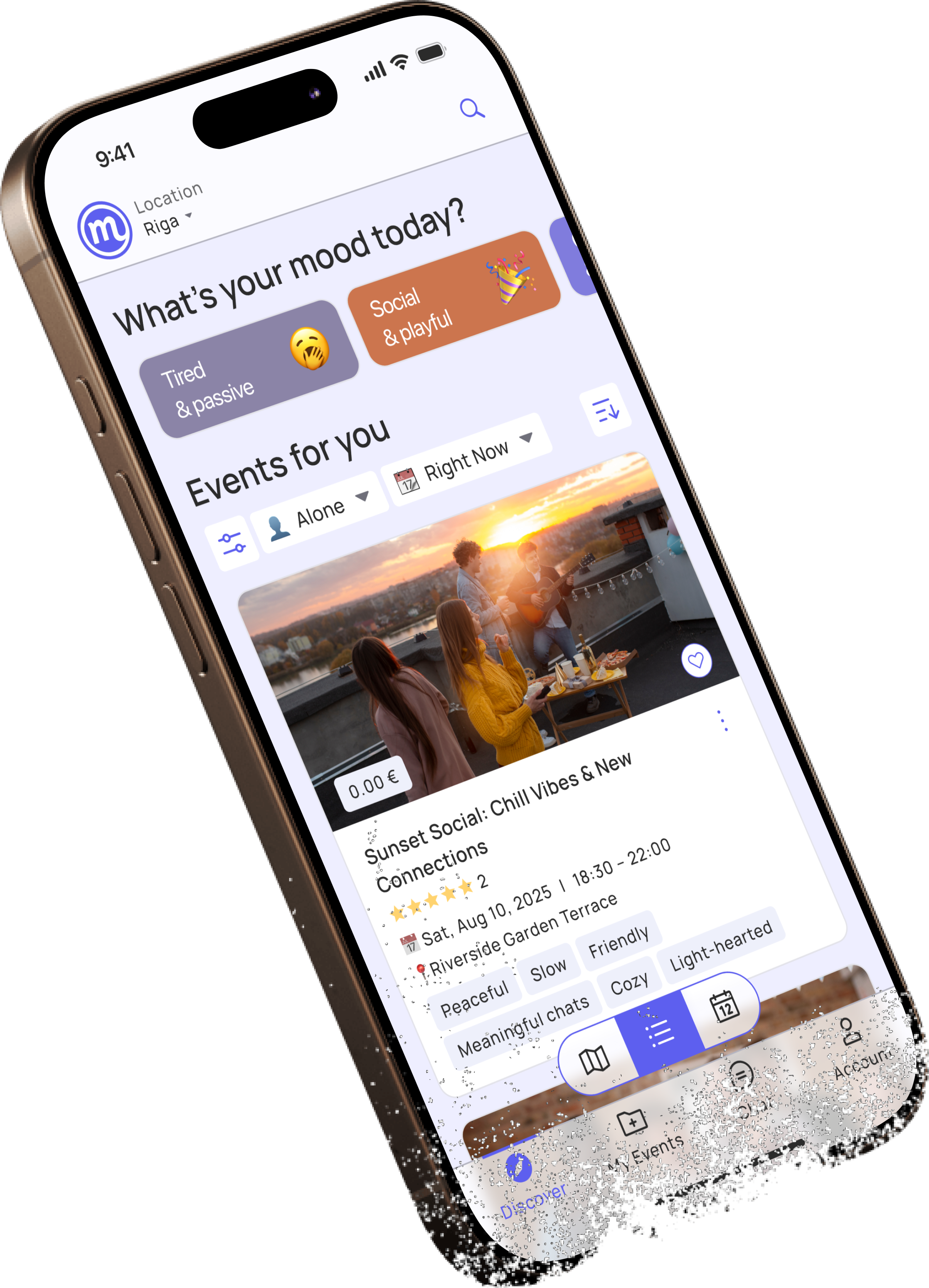
Meeta Events App.
Discover nearby activities and events tailored to your interests, schedule, and location.

Back to All Works
Scope
Research, UX/UI, Prototyping
Platform
iOS Mobile App
Timeline
1 Week
YEAR
2025

01/
Background
Project Context
This was a self-initiated concept exploring a different approach to event discovery. Rather than designing another search-first marketplace, the project investigated how contextual recommendations and simplified decision-making could help users discover relevant experiences faster.
The project focused on answering three key questions:
- How might users discover activities without knowing exactly what they are looking for?
- Which factors influence spontaneous decisions more than traditional categories?
- How can browsing feel inspiring instead of overwhelming?
02/
Problem
The Challenge
People often want to do something after work, on weekends, or while visiting a new city, but discovering the right activity is surprisingly difficult. Existing event platforms prioritize searching through large catalogs instead of helping users quickly find experiences that match their current context.
Users frequently face long lists of generic events, overwhelming filters, and little personalization, leading to decision fatigue and missed opportunities. The goal of this project was to explore how a mobile experience could make event discovery feel more personal, intuitive, and effortless by focusing on how people actually decide what to do.
03/
Approach
Design Process Framework
A structured, iterative Double-Diamond design methodology was employed to navigate from initial ambiguity to a highly validated, polished interactive experience.
Double Diamond

Reviewed five event platforms
Identified discovery patterns
Defined three user scenarios
Mapped recurring user needs
Prioritized opportunities
Defined product strategy
Explored navigation models
Designed contextual filtering
Built interaction patterns
Final prototype
High-fidelity UI
Define
Synthesizing insights
Develop
Exploring and designing solutions
Deliver
Final solution
Discover
Understanding the problem and users

04/
User Research
Understanding Users
The product targeted three primary audiences, which were expanded into broader proto-personas to better understand motivations, behaviors, needs, and pain points.
01
People looking for new experiences
People seeking meaningful ways to spend their free time without extensive planning.
Goals:
Break daily routine
Find enjoyable local experiences
Feel socially connected
Pain Points:
Endless scrolling
Too many irrelevant events
Unsure which events fit their mood




02
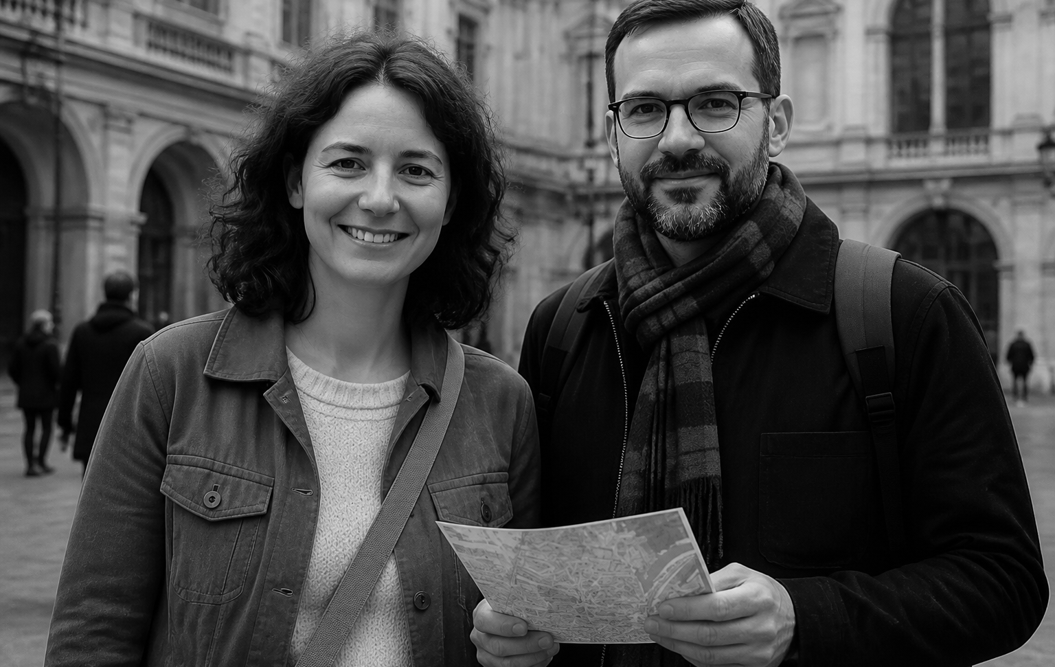
Tourists exploring a new city
Students, tourists, and newcomers looking for authentic local experiences.
Goals:
Discover hidden places
Meet people
Experience local culture
Pain Points:
Tourist-focused recommendations
Difficult to judge event atmosphere
Limited budget


03
Busy professionals with limited free time
People with limited free time looking for low-effort planning.
Goals:
Find something worthwhile quickly
Avoid complicated planning
Make better use of free evenings
Pain Points:
Decision fatigue
Information overload
Events that don't match available time


05/
Market Research
Competitor Analysis
Competitor analysis explored event discovery, local experiences, and personalized recommendations, focusing on content discovery, search, filtering, personalization, and event presentation. The findings revealed opportunities to simplify the experience while following familiar mobile patterns.





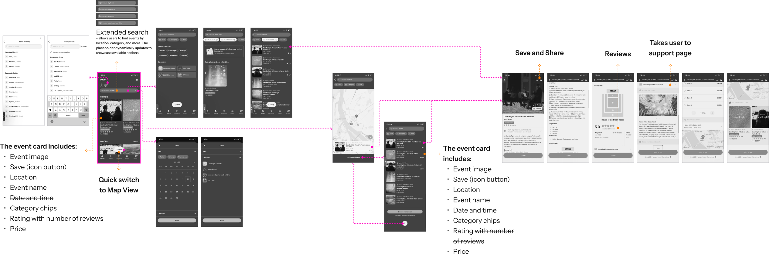
While each platform excels in a specific area, none combines contextual personalization, effortless discovery, and simplified decision-making into a single experience.
06/
Insights
Synthesizing Insights
After analyzing the proto-personas, recurring needs, frustrations, and motivations were identified to shape the product experience. Card sorting grouped key insights into three main experience areas and translated user expectations into relevant product features.
01
Feed of events - Fast decision
When - Day

Right now
#Right_now
#Happening_now
#Avoids_events_too_far

Today
#Evenings
#After-work
#Avoids_events_too_far
Weekend
#Weekend_plans
#Weekends
#Specific_weekend
Plan ahead
#Days_ahead
#Time-based_filters
#In_advance
#Schedules
When - Time
Day
#Avoids_events_late_in_the_evening
Evening
#Evenings
#After-work
Night
#Evenings
#After-work
All day
#Weekend_plans
#Weekends
Who
Alone
#Alone
#Introvert
With a friend
#Friend
With a partner
#Couple
With a smallgroup (2-4)
#Group-friendly
#Group_of_friends
With a large group (5+)
#3-6 people
#Group-friendly
#Group_of_friends
Family / Kid-friendly
#Parent
#Busy_mom
#Family-friendly events
Pet-friendly
#Pet_friendly
Mood - I feel...
Tired / passive
#Without_stress
#Low_effort
#Chill_events
#Low-energy
#Effort_level
#Relaxing
Social & playful
#Group_of_friends
#Socially_active
#Social
#Playfull
#Full_of_energy
Romantic
#Intimate_events_with_charm
#Couple
#Atmosphere
#Intimate_or_thematic_experiences
Reflective & solo
#Small_talk_yes/no
#don't_require_lots_of_planning
#Solo-traveller
Curious & creative
#Explore_new_things_nearby
#Unique_and_real_event
Open & spontaneous
#Casual_event
#Spontaneous
Family & community focused
#With_kids
#Baby-sitting_available
#For_parents
#Meeting_other_moms_or_families
#Child_to_be_social
02
Advanced Filters
Goals

When
Where
Interests
Duration
Price
Rating
Status
Social context
Group size
Age group
Communication level
Accessibility & Services
03
Event details
Rating

Actions with event
07/
Visual Exploration
Visual Direction
Before designing the interface, different visual directions were explored to define the app's look and feel. This helped establish a modern, energetic, and welcoming style that guided the overall design.
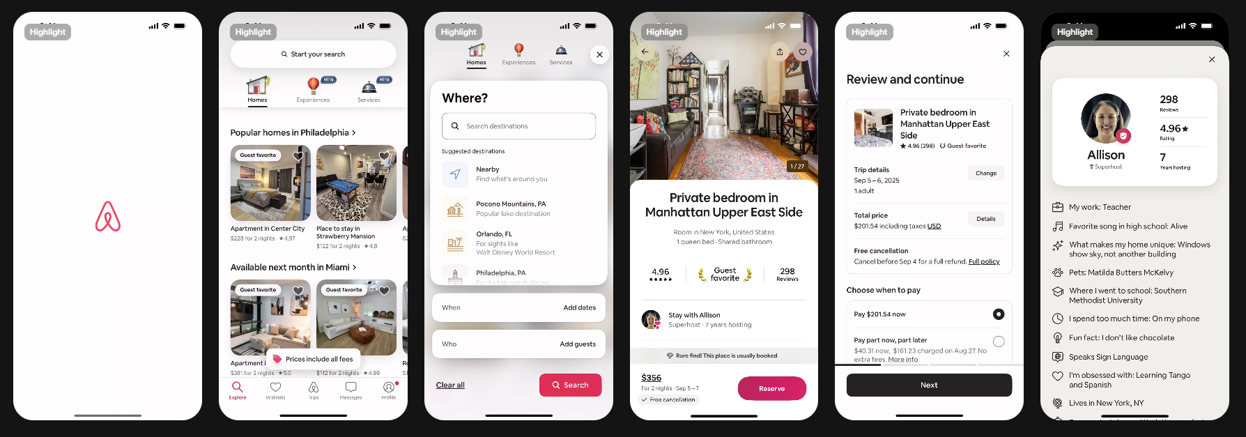
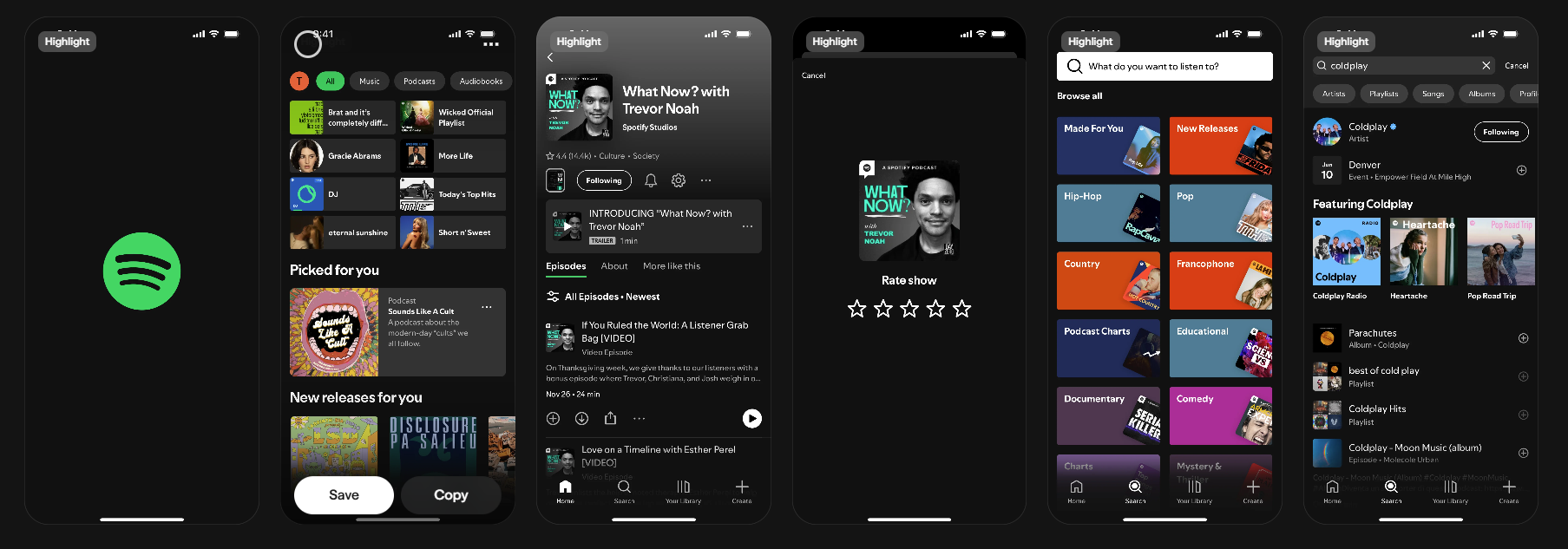
The visual direction combines Airbnb's warm, editorial presentation with Spotify's expressive use of mood and personalization. The goal was to create an interface that feels approachable, energetic, and inspires exploration rather than task completion.
Airbnb.
Clean layouts, warm and human design, strong typography and great event/city browsing UX.
Spotify.
Mood, intention, and personalization visually
08/
Design Strategy
Key UX Decisions
01
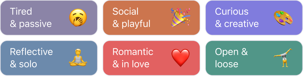
Mood-first recommendations
Instead of asking users what category they want, recommendations begin with how they currently feel.
People naturally think: "I want something relaxing."
rather than "Show me cultural activities."

02
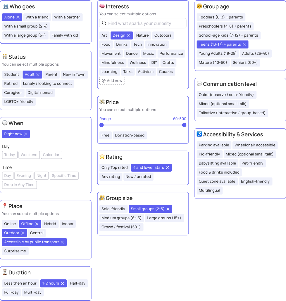
Contextual Filters
Filtering focuses on factors that influence real-world decisions:
- Mood
- Time
- Budget
- Distance
- Group size
- Communication level
- Accessibility
This reduces unnecessary filtering while increasing relevance.
03
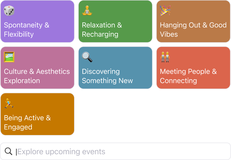
Flexible Search
The experience supports two browsing behaviors:
- Users searching for a specific activity.
- Users looking for inspiration.
Both flows coexist without overwhelming the interface.
04
Multiple exploration modes
Different users naturally plan differently. Some prefer browsing visually. Others think geographically. Some schedule around their calendar.
Supporting List, Map, and Calendar views accommodates all three behaviors without changing the core experience.

05
Simplified Event Details
Important information is prioritized according to users' decision-making process, helping them quickly determine whether an event is right for them.
The primary action, Join Event, remains visible and easily accessible throughout the experience.
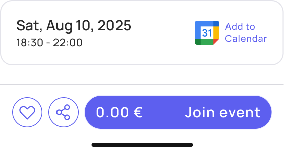
Secondary actions, such as Save, Share, and Add to Calendar, are also available, allowing users to revisit the event later if they are not ready to commit immediately.
09/
The Solution
Experience Overview
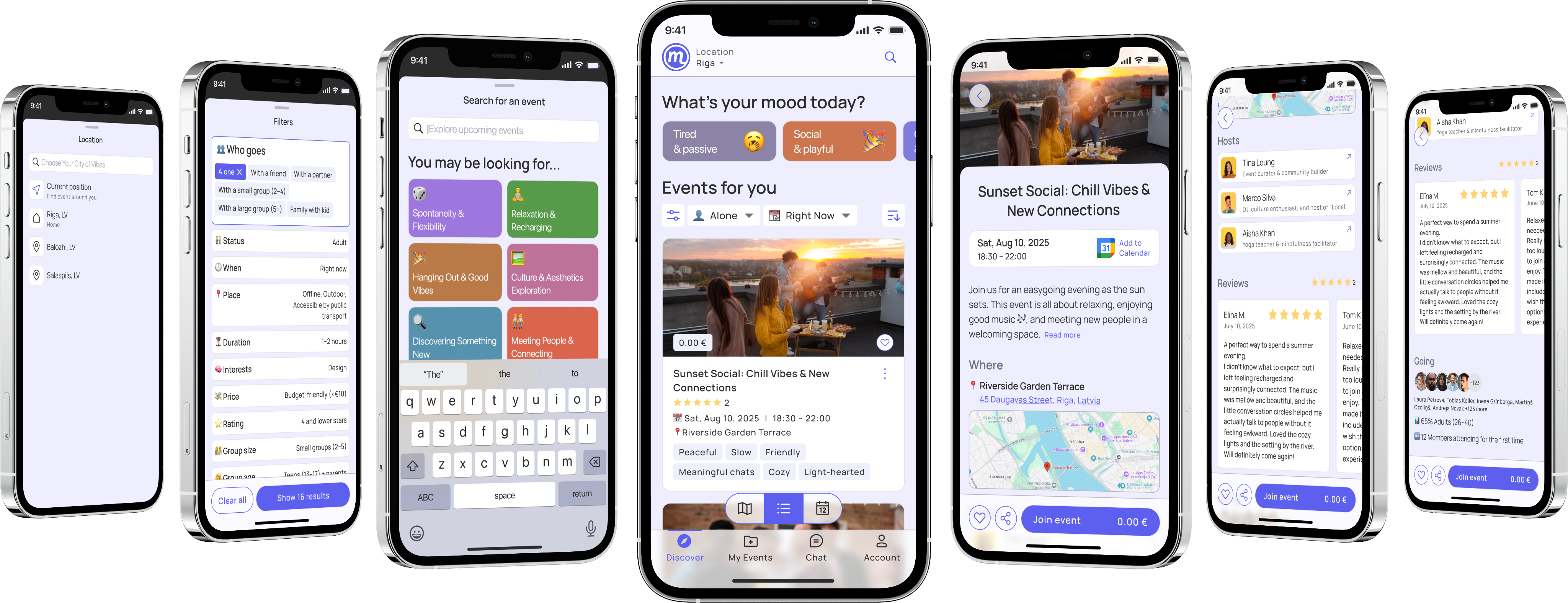
The final concept combines personalized recommendations with contextual filtering to create a faster and more intuitive event discovery experience.
Instead of overwhelming users with hundreds of generic options, the interface adapts to their current situation, helping them discover meaningful experiences with fewer decisions and less effort.
10/
Evaluation
Results & Learnings
Although this was a concept project, it demonstrated several valuable design principles.
What worked
- Contextual recommendations feel more natural than category-first browsing.
- Mood-based discovery creates more engaging exploration.
- Simplified information hierarchy supports faster decisions.
- Multiple browsing modes accommodate different planning behaviors.
What I'd improve
With additional time, I would:
- Conduct usability testing with real users.
- Validate the effectiveness of mood-based recommendations.
- Explore AI-powered personalization.
- Design onboarding to better understand user preferences.
- Measure success using discovery time, event saves, and join conversion.
11/
Reflection
Key Takeaways
One of the biggest takeaways from this project was realizing that people rarely think in categories when deciding what to do. They think in terms of mood, time, energy, and company. Designing around these natural decision-making patterns shifted the experience from searching for events to discovering experiences.

Meet your emotions!

Previous Project
Archive (2019-2022)
Next Project
Back Office for Public Transport

© 2026 Tseux. All rights reserved. Made with intent.


Meeta Events App.
Discover nearby activities and events tailored to your interests, schedule, and location.
Back to All Works
Scope
Research, UX/UI, Prototyping
Platform
iOS Mobile App
Timeline
1 Week
YEAR
2025

01/
Background
Project Context
This was a self-initiated concept exploring a different approach to event discovery. Rather than designing another search-first marketplace, the project investigated how contextual recommendations and simplified decision-making could help users discover relevant experiences faster.
The project focused on answering three key questions:
- How might users discover activities without knowing exactly what they are looking for?
- Which factors influence spontaneous decisions more than traditional categories?
- How can browsing feel inspiring instead of overwhelming?
02/
Problem
The Challenge
People often want to do something after work, on weekends, or while visiting a new city, but discovering the right activity is surprisingly difficult. Existing event platforms prioritize searching through large catalogs instead of helping users quickly find experiences that match their current context.
Users frequently face long lists of generic events, overwhelming filters, and little personalization, leading to decision fatigue and missed opportunities. The goal of this project was to explore how a mobile experience could make event discovery feel more personal, intuitive, and effortless by focusing on how people actually decide what to do.
03/
Approach
Design Process Framework
A structured, iterative Double-Diamond design methodology was employed to navigate from initial ambiguity to a highly validated, polished interactive experience.
Double Diamond

Reviewed five event platforms
Identified discovery patterns
Defined three user scenarios
Mapped recurring user needs
Prioritized opportunities
Defined product strategy
Explored navigation models
Designed contextual filtering
Built interaction patterns
Final prototype
High-fidelity UI
Define
Synthesizing insights
Develop
Exploring and designing solutions
Deliver
Final solution
Discover
Understanding the problem and users

04/
User Research
Understanding Users
The product targeted three primary audiences, which were expanded into broader proto-personas to better understand motivations, behaviors, needs, and pain points.
01
People looking for new experiences
People seeking meaningful ways to spend their free time without extensive planning.
Goals:
Break daily routine
Find enjoyable local experiences
Feel socially connected
Pain Points:
Endless scrolling
Too many irrelevant events
Unsure which events fit their mood

02
Tourists exploring a new city
Students, tourists, and newcomers looking for authentic local experiences.
Goals:
Discover hidden places
Meet people
Experience local culture
Pain Points:
Tourist-focused recommendations
Difficult to judge event atmosphere
Limited budget
03
Busy professionals with limited free time
People with limited free time looking for low-effort planning.
Goals:
Find something worthwhile quickly
Avoid complicated planning
Make better use of free evenings
Pain Points:
Decision fatigue
Information overload
Events that don't match available time
05/
Market Research
Competitor Analysis
Competitor analysis explored event discovery, local experiences, and personalized recommendations, focusing on content discovery, search, filtering, personalization, and event presentation. The findings revealed opportunities to simplify the experience while following familiar mobile patterns.
While each platform excels in a specific area, none combines contextual personalization, effortless discovery, and simplified decision-making into a single experience.
06/
Insights
Synthesizing Insights
After analyzing the proto-personas, recurring needs, frustrations, and motivations were identified to shape the product experience. Card sorting grouped key insights into three main experience areas and translated user expectations into relevant product features.
01
Feed of events - Fast decision
When - Day
Right now
#Right_now
#Happening_now
#Avoids_events_too_far

Today
#Evenings
#After-work
#Avoids_events_too_far
Weekend
#Weekend_plans
#Weekends
#Specific_weekend
Plan ahead
#Days_ahead
#Time-based_filters
#In_advance
#Schedules
When - Time
Day
#Avoids_events_late_in_the_evening
Evening
#Evenings
#After-work
Night
#Evenings
#After-work
All day
#Weekend_plans
#Weekends
Who
Alone
#Alone
#Introvert
With a friend
#Friend
With a partner
#Couple
With a small group (2-4)
#Group-friendly
#Group_of_friends
With a large group (5+)
#3-6 people
#Group-friendly
#Group_of_friends
Family / Kid-friendly
#Parent
#Busy_mom
#Family-friendly events
Pet-friendly
#Pet_friendly
Mood - I feel...
Tired / passive
#Without_stress
#Low_effort
#Chill_events
#Low-energy
#Effort_level
#Relaxing
Social & playful
#Group_of_friends
#Socially_active
#Social
#Playfull
#Full_of_energy
Romantic
#Intimate_events_with_charm
#Couple
#Atmosphere
#Intimate_or_thematic_experiences
Reflective & solo
#Small_talk_yes/no
#don't_require_lots_of_planning
#Solo-traveller
Curious & creative
#Explore_new_things_nearby
#Unique_and_real_event
Open & spontaneous
#Casual_event
#Spontaneous
Family & community focused
#With_kids
#Baby-sitting_available
#For_parents
#Meeting_other_moms_or_families
#Child_to_be_social
02
Advanced Filters
Goals
When
Where
Interests
Duration
Price
Rating
Status
Social context
Group size
Age group
Communication level
Accessibility & Services
03
Event details
Rating
Actions with event
07/
Visual Exploration
Visual Direction
Before designing the interface, different visual directions were explored to define the app's look and feel. This helped establish a modern, energetic, and welcoming style that guided the overall design.
The visual direction combines Airbnb's warm, editorial presentation with Spotify's expressive use of mood and personalization. The goal was to create an interface that feels approachable, energetic, and inspires exploration rather than task completion.
Airbnb.
Clean layouts, warm and human design, strong typography and great event/city browsing UX.
Spotify.
Mood, intention, and personalization visually
08/
Design Strategy
Key UX Decisions
01
Mood-first recommendations
Instead of asking users what category they want, recommendations begin with how they currently feel.
People naturally think: "I want something relaxing."
rather than "Show me cultural activities."

02
Contextual Filters
Filtering focuses on factors that influence real-world decisions:
- Mood
- Time
- Budget
- Distance
- Group size
- Communication level
- Accessibility
This reduces unnecessary filtering while increasing relevance.
03
Flexible Search
The experience supports two browsing behaviors:
- Users searching for a specific activity.
- Users looking for inspiration.
Both flows coexist without overwhelming the interface.
04
Multiple exploration modes
Different users naturally plan differently. Some prefer browsing visually. Others think geographically. Some schedule around their calendar.
Supporting List, Map, and Calendar views accommodates all three behaviors without changing the core experience.
05
Simplified Event Details
Important information is prioritized according to users' decision-making process, helping them quickly determine whether an event is right for them.
The primary action, Join Event, remains visible and easily accessible throughout the experience.
Secondary actions, such as Save, Share, and Add to Calendar, are also available, allowing users to revisit the event later if they are not ready to commit immediately.
09/
The Solution
Experience Overview
The final concept combines personalized recommendations with contextual filtering to create a faster and more intuitive event discovery experience.
Instead of overwhelming users with hundreds of generic options, the interface adapts to their current situation, helping them discover meaningful experiences with fewer decisions and less effort.
10/
Evaluation
Results & Learnings
Although this was a concept project, it demonstrated several valuable design principles.
What worked
- Contextual recommendations feel more natural than category-first browsing.
- Mood-based discovery creates more engaging exploration.
- Simplified information hierarchy supports faster decisions.
- Multiple browsing modes accommodate different planning behaviors.
What I'd improve
With additional time, I would:
- Conduct usability testing with real users.
- Validate the effectiveness of mood-based recommendations.
- Explore AI-powered personalization.
- Design onboarding to better understand user preferences.
- Measure success using discovery time, event saves, and join conversion.
11/
Reflection
Key Takeaways
One of the biggest takeaways from this project was realizing that people rarely think in categories when deciding what to do. They think in terms of mood, time, energy, and company. Designing around these natural decision-making patterns shifted the experience from searching for events to discovering experiences.
Meet your emotions!
Previous Project
Archive (2019-2022)
Next Project
Back Office for Public Transport
© 2026 Tseux. All rights reserved. Made with intent.
Meeta Events App.
Discover nearby activities and events tailored to your interests, schedule, and location.
Back to All Works
Scope
Research, UX/UI, Prototyping
Platform
iOS Mobile App
Timeline
1 Week
YEAR
2025

01/
Background
Project Context
This was a self-initiated concept exploring a different approach to event discovery. Rather than designing another search-first marketplace, the project investigated how contextual recommendations and simplified decision-making could help users discover relevant experiences faster.
The project focused on answering three key questions:
- How might users discover activities without knowing exactly what they are looking for?
- Which factors influence spontaneous decisions more than traditional categories?
- How can browsing feel inspiring instead of overwhelming?
02/
Problem
The Challenge
People often want to do something after work, on weekends, or while visiting a new city, but discovering the right activity is surprisingly difficult. Existing event platforms prioritize searching through large catalogs instead of helping users quickly find experiences that match their current context.
Users frequently face long lists of generic events, overwhelming filters, and little personalization, leading to decision fatigue and missed opportunities. The goal of this project was to explore how a mobile experience could make event discovery feel more personal, intuitive, and effortless by focusing on how people actually decide what to do.
03/
Approach
Design Process Framework
A structured, iterative Double-Diamond design methodology was employed to navigate from initial ambiguity to a highly validated, polished interactive experience.
Double Diamond

Discover
Understanding the problem and users
Reviewed five event platforms
Identified discovery patterns
Defined three user scenarios
Mapped recurring user needs
Prioritized opportunities
Defined product strategy
Explored navigation models
Designed contextual filtering
Built interaction patterns
Final prototype
High-fidelity UI
Define
Synthesizing insights
Develop
Exploring and designing solutions
Deliver
Final solution
04/
User Research
Understanding Users
The product targeted three primary audiences, which were expanded into broader proto-personas to better understand motivations, behaviors, needs, and pain points.
01
People looking for new experiences
People seeking meaningful ways to spend their free time without extensive planning.
Goals:
Break daily routine
Find enjoyable local experiences
Feel socially connected
Pain Points:
Endless scrolling
Too many irrelevant events
Unsure which events fit their mood

02
Tourists exploring a new city
Students, tourists, and newcomers looking for authentic local experiences.
Goals:
Discover hidden places
Meet people
Experience local culture
Pain Points:
Tourist-focused recommendations
Difficult to judge event atmosphere
Limited budget
03
Busy professionals with limited free time
People with limited free time looking for low-effort planning.
Goals:
Find something worthwhile quickly
Avoid complicated planning
Make better use of free evenings
Pain Points:
Decision fatigue
Information overload
Events that don't match available time
05/
Market Research
Competitor Analysis
Competitor analysis explored event discovery, local experiences, and personalized recommendations, focusing on content discovery, search, filtering, personalization, and event presentation. The findings revealed opportunities to simplify the experience while following familiar mobile patterns.
Feature
Fever
Meetup
Eventbrite
Airbnb
Luma
Opportunity for Meeta
Primary focus
Local events & entertainment
Communities & recurring groups
Event discovery & ticketing
Curated local experiences
Tech, creative & community events
Personalized activity discovery
Discovery
Personalized feed
Community-first
Search-first
Curated recommendations
Feed + invite network
Context-aware recommendations
Search
Good
Basic
Advanced
Moderate
Good
Flexible search + inspiration
Personalization
Interests & previous activity
Joined groups
Minimal
Travel interests
Network & interests
Mood, time, social context, budget, interests
Filters
Category, date, location
Category, distance
Extensive traditional filters
Category, date, price
Topic, date, location
Real-life contextual filters
Social features
Limited
Excellent
Limited
Moderate
Excellent
Contextual social discovery
Visual design
★★★★★
★★★☆☆
★★★★☆
★★★★★
★★★★★
Modern, minimal UI
Decision support
Good event cards
Community descriptions
Detailed event pages
Strong storytelling
Simple event pages
Simplified decision-making hierarchy
Main strength
Inspiring discovery
Strong communities
Huge event catalog
Premium experience
Modern community platform
Personalized, effortless discovery
Main weakness
Entertainment-focused
Outdated UX
Information overload
Travel-focused
Niche audience
Combines inspiration with contextual personalization
While each platform excels in a specific area, none combines contextual personalization, effortless discovery, and simplified decision-making into a single experience.
06/
Insights
Synthesizing Insights
After analyzing the proto-personas, recurring needs, frustrations, and motivations were identified to shape the product experience. Card sorting grouped key insights into three main experience areas and translated user expectations into relevant product features.
01
Feed of events - Fast decision
When - Day
Right now
#Right_now
#Happening_now
#Avoids_events_too_far

Today
#Evenings
#After-work
#Avoids_events_too_far
Weekend
#Weekend_plans
#Weekends
#Specific_weekend
Plan ahead
#Days_ahead
#Time-based_filters
#In_advance
#Schedules
When - Time
Day
#Avoids_events_late_in_the_evening
Evening
#Evenings
#After-work
Night
#Evenings
#After-work
All day
#Weekend_plans
#Weekends
Who
Alone
#Alone
#Introvert
With a friend
#Friend
With a partner
#Couple
With a small group (2-4)
#Group-friendly
#Group_of_friends
With a large group (5+)
#3-6 people
#Group-friendly
#Group_of_friends
Family / Kid-friendly
#Parent
#Busy_mom
#Family-friendly events
Pet-friendly
#Pet_friendly
Mood - I feel...
Tired / passive
#Without_stress
#Low_effort
#Chill_events
#Low-energy
#Effort_level
#Relaxing
Social & playful
#Group_of_friends
#Socially_active
#Social
#Playfull
#Full_of_energy
Romantic
#Intimate_events_with_charm
#Couple
#Atmosphere
#Intimate_or_thematic_experiences
Reflective & solo
#Small_talk_yes/no
#don't_require_lots_of_planning
#Solo-traveller
Curious & creative
#Explore_new_things_nearby
#Unique_and_real_event
Open & spontaneous
#Casual_event
#Spontaneous
Family & community focused
#With_kids
#Baby-sitting_available
#For_parents
#Meeting_other_moms_or_families
#Child_to_be_social
02
Advanced Filters
Goals
When
Where
Interests
Duration
Price
Rating
Status
Social context
Group size
Age group
Communication level
Accessibility & Services
03
Event details
Rating
Actions with event
07/
Visual Exploration
Visual Direction
Before designing the interface, different visual directions were explored to define the app's look and feel. This helped establish a modern, energetic, and welcoming style that guided the overall design.
The visual direction combines Airbnb's warm, editorial presentation with Spotify's expressive use of mood and personalization. The goal was to create an interface that feels approachable, energetic, and inspires exploration rather than task completion.
Airbnb.
Clean layouts, warm and human design, strong typography and great event/city browsing UX.
Spotify.
Mood, intention, and personalization visually
08/
Design Strategy
Key UX Decisions
01
Mood-first recommendations
Instead of asking users what category they want, recommendations begin with how they currently feel.
People naturally think: "I want something relaxing."
rather than "Show me cultural activities."

02
Contextual Filters
Filtering focuses on factors that influence real-world decisions:
- Mood
- Time
- Budget
- Distance
- Group size
- Communication level
- Accessibility
This reduces unnecessary filtering while increasing relevance.
03
Flexible Search
The experience supports two browsing behaviors:
- Users searching for a specific activity.
- Users looking for inspiration.
Both flows coexist without overwhelming the interface.
04
Multiple exploration modes
Different users naturally plan differently. Some prefer browsing visually. Others think geographically. Some schedule around their calendar.
Supporting List, Map, and Calendar views accommodates all three behaviors without changing the core experience.
05
Simplified Event Details
Important information is prioritized according to users' decision-making process, helping them quickly determine whether an event is right for them.
The primary action, Join Event, remains visible and easily accessible throughout the experience.
Secondary actions, such as Save, Share, and Add to Calendar, are also available, allowing users to revisit the event later if they are not ready to commit immediately.
09/
The Solution
Experience Overview
The final concept combines personalized recommendations with contextual filtering to create a faster and more intuitive event discovery experience.
Instead of overwhelming users with hundreds of generic options, the interface adapts to their current situation, helping them discover meaningful experiences with fewer decisions and less effort.
10/
Evaluation
Results & Learnings
Although this was a concept project, it demonstrated several valuable design principles.
What worked
- Contextual recommendations feel more natural than category-first browsing.
- Mood-based discovery creates more engaging exploration.
- Simplified information hierarchy supports faster decisions.
- Multiple browsing modes accommodate different planning behaviors.
What I'd improve
With additional time, I would:
- Conduct usability testing with real users.
- Validate the effectiveness of mood-based recommendations.
- Explore AI-powered personalization.
- Design onboarding to better understand user preferences.
- Measure success using discovery time, event saves, and join conversion.
11/
Reflection
Key Takeaways
One of the biggest takeaways from this project was realizing that people rarely think in categories when deciding what to do. They think in terms of mood, time, energy, and company. Designing around these natural decision-making patterns shifted the experience from searching for events to discovering experiences.
Meet your emotions!
Previous Project
Archive (2019-2022)
Next Project
Back Office for Public Transport
© 2026 Tseux. All rights reserved. Made with intent.
Meeta Events App.
Discover nearby activities and events tailored to your interests, schedule, and location.
Back to All Works
Scope
Research, UX/UI, Prototyping
Platform
iOS Mobile App
Timeline
1 Week
YEAR
2025

01/
Background
Project Context
This was a self-initiated concept exploring a different approach to event discovery. Rather than designing another search-first marketplace, the project investigated how contextual recommendations and simplified decision-making could help users discover relevant experiences faster.
The project focused on answering three key questions:
- How might users discover activities without knowing exactly what they are looking for?
- Which factors influence spontaneous decisions more than traditional categories?
- How can browsing feel inspiring instead of overwhelming?
02/
Problem
The Challenge
People often want to do something after work, on weekends, or while visiting a new city, but discovering the right activity is surprisingly difficult. Existing event platforms prioritize searching through large catalogs instead of helping users quickly find experiences that match their current context.
Users frequently face long lists of generic events, overwhelming filters, and little personalization, leading to decision fatigue and missed opportunities. The goal of this project was to explore how a mobile experience could make event discovery feel more personal, intuitive, and effortless by focusing on how people actually decide what to do.
03/
Approach
Design Process Framework
A structured, iterative Double-Diamond design methodology was employed to navigate from initial ambiguity to a highly validated, polished interactive experience.
Double Diamond

Discover
Understanding the problem and users
Reviewed five event platforms
Identified discovery patterns
Defined three user scenarios
Mapped recurring user needs
Prioritized opportunities
Defined product strategy
Explored navigation models
Designed contextual filtering
Built interaction patterns
Final prototype
High-fidelity UI
Define
Synthesizing insights
Develop
Exploring and designing solutions
Deliver
Final solution

04/
User Research
Understanding Users
The product targeted three primary audiences, which were expanded into broader proto-personas to better understand motivations, behaviors, needs, and pain points.
01
People looking for new experiences
People seeking meaningful ways to spend their free time without extensive planning.
Goals:
Break daily routine
Find enjoyable local experiences
Feel socially connected
Pain Points:
Endless scrolling
Too many irrelevant events
Unsure which events fit their mood

02
Tourists exploring a new city
Students, tourists, and newcomers looking for authentic local experiences.
Goals:
Discover hidden places
Meet people
Experience local culture
Pain Points:
Tourist-focused recommendations
Difficult to judge event atmosphere
Limited budget
03
Busy professionals with limited free time
People with limited free time looking for low-effort planning.
Goals:
Find something worthwhile quickly
Avoid complicated planning
Make better use of free evenings
Pain Points:
Decision fatigue
Information overload
Events that don't match available time
05/
Market Research
Competitor Analysis
Competitor analysis explored event discovery, local experiences, and personalized recommendations, focusing on content discovery, search, filtering, personalization, and event presentation. The findings revealed opportunities to simplify the experience while following familiar mobile patterns.
Feature
Fever
Meetup
Eventbrite
Airbnb Experiences
Luma
Opportunity for Meeta
Primary focus
Local events & entertainment
Communities & recurring groups
Event discovery & ticketing
Curated local experiences
Tech, creative & community events
Personalized activity discovery
Discovery
Personalized feed
Community-first
Search-first
Curated recommendations
Feed + invite network
Context-aware recommendations
Search
Good
Basic
Advanced
Moderate
Good
Flexible search + inspiration
Personalization
Interests & previous activity
Joined groups
Minimal
Travel interests
Network & interests
Mood, time, social context, budget, interests
Filters
Category, date, location
Category, distance
Extensive traditional filters
Category, date, price
Topic, date, location
Real-life contextual filters
Social features
Limited
Excellent
Limited
Moderate
Excellent
Contextual social discovery
Visual design
★★★★★
★★★☆☆
★★★★☆
★★★★★
★★★★★
Modern, minimal UI
Decision support
Good event cards
Community descriptions
Detailed event pages
Strong storytelling
Simple event pages
Simplified decision-making hierarchy
Main strength
Inspiring discovery
Strong communities
Huge event catalog
Premium experience
Modern community platform
Personalized, effortless discovery
Main weakness
Entertainment-focused
Outdated UX
Information overload
Travel-focused
Niche audience
Combines inspiration with contextual personalization
While each platform excels in a specific area, none combines contextual personalization, effortless discovery, and simplified decision-making into a single experience.
06/
Insights
Synthesizing Insights
After analyzing the proto-personas, recurring needs, frustrations, and motivations were identified to shape the product experience. Card sorting grouped key insights into three main experience areas and translated user expectations into relevant product features.
01
Feed of events - Fast decision
When - Day
Right now
#Right_now
#Happening_now
#Avoids_events_too_far

Today
#Evenings
#After-work
#Avoids_events_too_far
Weekend
#Weekend_plans
#Weekends
#Specific_weekend
Plan ahead
#Days_ahead
#Time-based_filters
#In_advance
#Schedules
When - Time
Day
#Avoids_events_late_in_the_evening
Evening
#Evenings
#After-work
Night
#Evenings
#After-work
All day
#Weekend_plans
#Weekends
Who
Alone
#Alone
#Introvert
With a friend
#Friend
With a partner
#Couple
With a small group (2-4)
#Group-friendly
#Group_of_friends
With a large group (5+)
#3-6 people
#Group-friendly
#Group_of_friends
Family / Kid-friendly
#Parent
#Busy_mom
#Family-friendly events
Pet-friendly
#Pet_friendly
Mood - I feel...
Tired / passive
#Without_stress
#Low_effort
#Chill_events
#Low-energy
#Effort_level
#Relaxing
Social & playful
#Group_of_friends
#Socially_active
#Social
#Playfull
#Full_of_energy
Romantic
#Intimate_events_with_charm
#Couple
#Atmosphere
#Intimate_or_thematic_experiences
Reflective & solo
#Small_talk_yes/no
#don't_require_lots_of_planning
#Solo-traveller
Curious & creative
#Explore_new_things_nearby
#Unique_and_real_event
Open & spontaneous
#Casual_event
#Spontaneous
Family & community focused
#With_kids
#Baby-sitting_available
#For_parents
#Meeting_other_moms_or_families
#Child_to_be_social
02
Advanced Filters
Goals
When
Where
Interests
Duration
Price
Rating
Status
Social context
Group size
Age group
Communication level
Accessibility & Services
03
Event details
Rating
Actions with event
07/
Visual Exploration
Visual Direction
Before designing the interface, different visual directions were explored to define the app's look and feel. This helped establish a modern, energetic, and welcoming style that guided the overall design.
The visual direction combines Airbnb's warm, editorial presentation with Spotify's expressive use of mood and personalization. The goal was to create an interface that feels approachable, energetic, and inspires exploration rather than task completion.
Airbnb.
Clean layouts, warm and human design, strong typography and great event/city browsing UX.
Spotify.
Mood, intention, and personalization visually
08/
Design Strategy
Key UX Decisions
01
Mood-first recommendations
Instead of asking users what category they want, recommendations begin with how they currently feel.
People naturally think: "I want something relaxing."
rather than "Show me cultural activities."

02
Contextual Filters
Filtering focuses on factors that influence real-world decisions:
- Mood
- Time
- Budget
- Distance
- Group size
- Communication level
- Accessibility
This reduces unnecessary filtering while increasing relevance.
03
Flexible Search
The experience supports two browsing behaviors:
- Users searching for a specific activity.
- Users looking for inspiration.
Both flows coexist without overwhelming the interface.
04
Multiple exploration modes
Different users naturally plan differently. Some prefer browsing visually. Others think geographically. Some schedule around their calendar.
Supporting List, Map, and Calendar views accommodates all three behaviors without changing the core experience.
05
Simplified Event Details
Important information is prioritized according to users' decision-making process, helping them quickly determine whether an event is right for them.
The primary action, Join Event, remains visible and easily accessible throughout the experience.
Secondary actions, such as Save, Share, and Add to Calendar, are also available, allowing users to revisit the event later if they are not ready to commit immediately.
09/
The Solution
Experience Overview
The final concept combines personalized recommendations with contextual filtering to create a faster and more intuitive event discovery experience.
Instead of overwhelming users with hundreds of generic options, the interface adapts to their current situation, helping them discover meaningful experiences with fewer decisions and less effort.
10/
Evaluation
Results & Learnings
Although this was a concept project, it demonstrated several valuable design principles.
What worked
- Contextual recommendations feel more natural than category-first browsing.
- Mood-based discovery creates more engaging exploration.
- Simplified information hierarchy supports faster decisions.
- Multiple browsing modes accommodate different planning behaviors.
What I'd improve
With additional time, I would:
- Conduct usability testing with real users.
- Validate the effectiveness of mood-based recommendations.
- Explore AI-powered personalization.
- Design onboarding to better understand user preferences.
- Measure success using discovery time, event saves, and join conversion.
11/
Reflection
Key Takeaways
One of the biggest takeaways from this project was realizing that people rarely think in categories when deciding what to do. They think in terms of mood, time, energy, and company. Designing around these natural decision-making patterns shifted the experience from searching for events to discovering experiences.
Meet your emotions!
Previous Project
Archive (2019-2022)
Next Project
Back Office for Public Transport
© 2026 Tseux. All rights reserved. Made with intent.
Meeta Events App.
Discover nearby activities and events tailored to your interests, schedule, and location.
Back to All Works
Scope
Research, UX/UI, Prototyping
Platform
iOS Mobile App
Timeline
1 Week
YEAR
2025

01/
Background
Project Context
This was a self-initiated concept exploring a different approach to event discovery. Rather than designing another search-first marketplace, the project investigated how contextual recommendations and simplified decision-making could help users discover relevant experiences faster.
The project focused on answering three key questions:
- How might users discover activities without knowing exactly what they are looking for?
- Which factors influence spontaneous decisions more than traditional categories?
- How can browsing feel inspiring instead of overwhelming?
02/
Problem
The Challenge
People often want to do something after work, on weekends, or while visiting a new city, but discovering the right activity is surprisingly difficult. Existing event platforms prioritize searching through large catalogs instead of helping users quickly find experiences that match their current context.
Users frequently face long lists of generic events, overwhelming filters, and little personalization, leading to decision fatigue and missed opportunities. The goal of this project was to explore how a mobile experience could make event discovery feel more personal, intuitive, and effortless by focusing on how people actually decide what to do.
03/
Approach
Design Process Framework
A structured, iterative Double-Diamond design methodology was employed to navigate from initial ambiguity to a highly validated, polished interactive experience.
Double Diamond
Discover
Understanding the problem and users
Reviewed five event platforms
Identified discovery patterns
Defined three user scenarios
Mapped recurring user needs
Prioritized opportunities
Defined product strategy
Explored navigation models
Designed contextual filtering
Built interaction patterns
Final prototype
High-fidelity UI
Define
Synthesizing insights
Develop
Exploring and designing solutions
Deliver
Final solution
04/
User Research
Understanding Users
The product targeted three primary audiences, which were expanded into broader proto-personas to better understand motivations, behaviors, needs, and pain points.
01
People looking for new experiences
People seeking meaningful ways to spend their free time without extensive planning.
Goals:
Break daily routine
Find enjoyable local experiences
Feel socially connected
Pain Points:
Endless scrolling
Too many irrelevant events
Unsure which events fit their mood

02
Tourists exploring a new city
Students, tourists, and newcomers looking for authentic local experiences.
Goals:
Discover hidden places
Meet people
Experience local culture
Pain Points:
Tourist-focused recommendations
Difficult to judge event atmosphere
Limited budget
03
Busy professionals with limited free time
People with limited free time looking for low-effort planning.
Goals:
Find something worthwhile quickly
Avoid complicated planning
Make better use of free evenings
Pain Points:
Decision fatigue
Information overload
Events that don't match available time
05/
Market Research
Competitor Analysis
Competitor analysis explored event discovery, local experiences, and personalized recommendations, focusing on content discovery, search, filtering, personalization, and event presentation. The findings revealed opportunities to simplify the experience while following familiar mobile patterns.
Feature
Fever
Meetup
Eventbrite
Airbnb Experiences
Luma
Opportunity for Meeta
Primary focus
Local events & entertainment
Communities & recurring groups
Event discovery & ticketing
Curated local experiences
Tech, creative & community events
Personalized activity discovery
Discovery
Personalized feed
Community-first
Search-first
Curated recommendations
Feed + invite network
Context-aware recommendations
Search
Good
Basic
Advanced
Moderate
Good
Flexible search + inspiration
Personalization
Interests & previous activity
Joined groups
Minimal
Travel interests
Network & interests
Mood, time, social context, budget, interests
Filters
Category, date, location
Category, distance
Extensive traditional filters
Category, date, price
Topic, date, location
Real-life contextual filters
Social features
Limited
Excellent
Limited
Moderate
Excellent
Contextual social discovery
Visual design
★★★★★
★★★☆☆
★★★★☆
★★★★★
★★★★★
Modern, minimal UI
Decision support
Good event cards
Community descriptions
Detailed event pages
Strong storytelling
Simple event pages
Simplified decision-making hierarchy
Main strength
Inspiring discovery
Strong communities
Huge event catalog
Premium experience
Modern community platform
Personalized, effortless discovery
Main weakness
Entertainment-focused
Outdated UX
Information overload
Travel-focused
Niche audience
Combines inspiration with contextual personalization
While each platform excels in a specific area, none combines contextual personalization, effortless discovery, and simplified decision-making into a single experience.
06/
Insights
Synthesizing Insights
After analyzing the proto-personas, recurring needs, frustrations, and motivations were identified to shape the product experience. Card sorting grouped key insights into three main experience areas and translated user expectations into relevant product features.
01
Feed of events - Fast decision
When - Day
Right now
#Right_now
#Happening_now
#Avoids_events_too_far

Today
#Evenings
#After-work
#Avoids_events_too_far
Weekend
#Weekend_plans
#Weekends
#Specific_weekend
Plan ahead
#Days_ahead
#Time-based_filters
#In_advance
#Schedules
When - Time
Day
#Avoids_events_late_in_the_evening
Evening
#Evenings
#After-work
Night
#Evenings
#After-work
All day
#Weekend_plans
#Weekends
Who
Alone
#Alone
#Introvert
With a friend
#Friend
With a partner
#Couple
With a small group (2-4)
#Group-friendly
#Group_of_friends
With a large group (5+)
#3-6 people
#Group-friendly
#Group_of_friends
Family / Kid-friendly
#Parent
#Busy_mom
#Family-friendly events
Pet-friendly
#Pet_friendly
Mood - I feel...
Tired / passive
#Without_stress
#Low_effort
#Chill_events
#Low-energy
#Effort_level
#Relaxing
Social & playful
#Group_of_friends
#Socially_active
#Social
#Playfull
#Full_of_energy
Romantic
#Intimate_events_with_charm
#Couple
#Atmosphere
#Intimate_or_thematic_experiences
Reflective & solo
#Small_talk_yes/no
#don't_require_lots_of_planning
#Solo-traveller
Curious & creative
#Explore_new_things_nearby
#Unique_and_real_event
Open & spontaneous
#Casual_event
#Spontaneous
Family & community focused
#With_kids
#Baby-sitting_available
#For_parents
#Meeting_other_moms_or_families
#Child_to_be_social
02
Advanced Filters
Goals
When
Where
Interests
Duration
Price
Rating
Status
Social context
Group size
Age group
Communication level
Accessibility & Services
03
Event details
Rating
Actions with event
07/
Visual Exploration
Visual Direction
Before designing the interface, different visual directions were explored to define the app's look and feel. This helped establish a modern, energetic, and welcoming style that guided the overall design.
The visual direction combines Airbnb's warm, editorial presentation with Spotify's expressive use of mood and personalization. The goal was to create an interface that feels approachable, energetic, and inspires exploration rather than task completion.
Airbnb.
Clean layouts, warm and human design, strong typography and great event/city browsing UX.
Spotify.
Mood, intention, and personalization visually
08/
Design Strategy
Key UX Decisions
01
Mood-first recommendations
Instead of asking users what category they want, recommendations begin with how they currently feel.
People naturally think: "I want something relaxing."
rather than "Show me cultural activities."

02
Contextual Filters
Filtering focuses on factors that influence real-world decisions:
- Mood
- Time
- Budget
- Distance
- Group size
- Communication level
- Accessibility
This reduces unnecessary filtering while increasing relevance.
03
Flexible Search
The experience supports two browsing behaviors:
- Users searching for a specific activity.
- Users looking for inspiration.
Both flows coexist without overwhelming the interface.
04
Multiple exploration modes
Different users naturally plan differently. Some prefer browsing visually. Others think geographically. Some schedule around their calendar.
Supporting List, Map, and Calendar views accommodates all three behaviors without changing the core experience.
05
Simplified Event Details
Important information is prioritized according to users' decision-making process, helping them quickly determine whether an event is right for them.
The primary action, Join Event, remains visible and easily accessible throughout the experience.
Secondary actions, such as Save, Share, and Add to Calendar, are also available, allowing users to revisit the event later if they are not ready to commit immediately.
09/
The Solution
Experience Overview
The final concept combines personalized recommendations with contextual filtering to create a faster and more intuitive event discovery experience.
Instead of overwhelming users with hundreds of generic options, the interface adapts to their current situation, helping them discover meaningful experiences with fewer decisions and less effort.
10/
Evaluation
Results & Learnings
Although this was a concept project, it demonstrated several valuable design principles.
What worked
- Contextual recommendations feel more natural than category-first browsing.
- Mood-based discovery creates more engaging exploration.
- Simplified information hierarchy supports faster decisions.
- Multiple browsing modes accommodate different planning behaviors.
What I'd improve
With additional time, I would:
- Conduct usability testing with real users.
- Validate the effectiveness of mood-based recommendations.
- Explore AI-powered personalization.
- Design onboarding to better understand user preferences.
- Measure success using discovery time, event saves, and join conversion.
11/
Reflection
Key Takeaways
One of the biggest takeaways from this project was realizing that people rarely think in categories when deciding what to do. They think in terms of mood, time, energy, and company. Designing around these natural decision-making patterns shifted the experience from searching for events to discovering experiences.
Meet your emotions!
Previous Project
Archive (2019-2022)
Next Project
Back Office for Public Transport
© 2026 Tseux. All rights reserved. Made with intent.

Meeta Events App.
Discover nearby activities and events tailored to your interests, schedule, and location.
Back to All Works
Scope
Research, UX/UI, Prototyping
Platform
iOS Mobile App
Timeline
1 Week
YEAR
2025

01/
Background
Project Context
This was a self-initiated concept exploring a different approach to event discovery. Rather than designing another search-first marketplace, the project investigated how contextual recommendations and simplified decision-making could help users discover relevant experiences faster.
The project focused on answering three key questions:
- How might users discover activities without knowing exactly what they are looking for?
- Which factors influence spontaneous decisions more than traditional categories?
- How can browsing feel inspiring instead of overwhelming?
02/
Problem
The Challenge
People often want to do something after work, on weekends, or while visiting a new city, but discovering the right activity is surprisingly difficult. Existing event platforms prioritize searching through large catalogs instead of helping users quickly find experiences that match their current context.
Users frequently face long lists of generic events, overwhelming filters, and little personalization, leading to decision fatigue and missed opportunities. The goal of this project was to explore how a mobile experience could make event discovery feel more personal, intuitive, and effortless by focusing on how people actually decide what to do.
03/
Approach
Design Process Framework
A structured, iterative Double-Diamond design methodology was employed to navigate from initial ambiguity to a highly validated, polished interactive experience.
Double Diamond
Discover
Understanding the problem and users
Reviewed five event platforms
Identified discovery patterns
Defined three user scenarios
Mapped recurring user needs
Prioritized opportunities
Defined product strategy
Explored navigation models
Designed contextual filtering
Built interaction patterns
Final prototype
High-fidelity UI
Define
Synthesizing insights
Develop
Exploring and designing solutions
Deliver
Final solution

04/
User Research
Understanding Users
The product targeted three primary audiences, which were expanded into broader proto-personas to better understand motivations, behaviors, needs, and pain points.
01
People looking for new experiences
People seeking meaningful ways to spend their free time without extensive planning.
Goals:
Break daily routine
Find enjoyable local experiences
Feel socially connected
Pain Points:
Endless scrolling
Too many irrelevant events
Unsure which events fit their mood

02
Tourists exploring a new city
Students, tourists, and newcomers looking for authentic local experiences.
Goals:
Discover hidden places
Meet people
Experience local culture
Pain Points:
Tourist-focused recommendations
Difficult to judge event atmosphere
Limited budget
03
Busy professionals with limited free time
People with limited free time looking for low-effort planning.
Goals:
Find something worthwhile quickly
Avoid complicated planning
Make better use of free evenings
Pain Points:
Decision fatigue
Information overload
Events that don't match available time
05/
Market Research
Competitor Analysis
Competitor analysis explored event discovery, local experiences, and personalized recommendations, focusing on content discovery, search, filtering, personalization, and event presentation. The findings revealed opportunities to simplify the experience while following familiar mobile patterns.
Feature
Fever
Meetup
Eventbrite
Airbnb Experiences
Luma
Opportunity for Meeta
Primary focus
Local events & entertainment
Communities & recurring groups
Event discovery & ticketing
Curated local experiences
Tech, creative & community events
Personalized activity discovery
Discovery
Personalized feed
Community-first
Search-first
Curated recommendations
Feed + invite network
Context-aware recommendations
Search
Good
Basic
Advanced
Moderate
Good
Flexible search + inspiration
Personalization
Interests & previous activity
Joined groups
Minimal
Travel interests
Network & interests
Mood, time, social context, budget, interests
Filters
Category, date, location
Category, distance
Extensive traditional filters
Category, date, price
Topic, date, location
Real-life contextual filters
Social features
Limited
Excellent
Limited
Moderate
Excellent
Contextual social discovery
Visual design
★★★★★
★★★☆☆
★★★★☆
★★★★★
★★★★★
Modern, minimal UI
Decision support
Good event cards
Community descriptions
Detailed event pages
Strong storytelling
Simple event pages
Simplified decision-making hierarchy
Main strength
Inspiring discovery
Strong communities
Huge event catalog
Premium experience
Modern community platform
Personalized, effortless discovery
Main weakness
Entertainment-focused
Outdated UX
Information overload
Travel-focused
Niche audience
Combines inspiration with contextual personalization
While each platform excels in a specific area, none combines contextual personalization, effortless discovery, and simplified decision-making into a single experience.
06/
Insights
Synthesizing Insights
After analyzing the proto-personas, recurring needs, frustrations, and motivations were identified to shape the product experience. Card sorting grouped key insights into three main experience areas and translated user expectations into relevant product features.
01
Feed of events - Fast decision
When - Day
Right now
#Right_now
#Happening_now
#Avoids_events_too_far

Today
#Evenings
#After-work
#Avoids_events_too_far
Weekend
#Weekend_plans
#Weekends
#Specific_weekend
Plan ahead
#Days_ahead
#Time-based_filters
#In_advance
#Schedules
When - Time
Day
#Avoids_events_late_in_the_evening
Evening
#Evenings
#After-work
Night
#Evenings
#After-work
All day
#Weekend_plans
#Weekends
Who
Alone
#Alone
#Introvert
With a friend
#Friend
With a partner
#Couple
With a small group (2-4)
#Group-friendly
#Group_of_friends
With a large group (5+)
#3-6 people
#Group-friendly
#Group_of_friends
Family / Kid-friendly
#Parent
#Busy_mom
#Family-friendly events
Pet-friendly
#Pet_friendly
Mood - I feel...
Tired / passive
#Without_stress
#Low_effort
#Chill_events
#Low-energy
#Effort_level
#Relaxing
Social & playful
#Group_of_friends
#Socially_active
#Social
#Playfull
#Full_of_energy
Romantic
#Intimate_events_with_charm
#Couple
#Atmosphere
#Intimate_or_thematic_experiences
Reflective & solo
#Small_talk_yes/no
#don't_require_lots_of_planning
#Solo-traveller
Curious & creative
#Explore_new_things_nearby
#Unique_and_real_event
Open & spontaneous
#Casual_event
#Spontaneous
Family & community focused
#With_kids
#Baby-sitting_available
#For_parents
#Meeting_other_moms_or_families
#Child_to_be_social
02
Advanced Filters
Goals
When
Where
Interests
Duration
Price
Rating
Status
Social context
Group size
Age group
Communication level
Accessibility & Services
03
Event details
Rating
Actions with event
07/
Visual Exploration
Visual Direction
Before designing the interface, different visual directions were explored to define the app's look and feel. This helped establish a modern, energetic, and welcoming style that guided the overall design.
The visual direction combines Airbnb's warm, editorial presentation with Spotify's expressive use of mood and personalization. The goal was to create an interface that feels approachable, energetic, and inspires exploration rather than task completion.
Airbnb.
Clean layouts, warm and human design, strong typography and great event/city browsing UX.
Spotify.
Mood, intention, and personalization visually
08/
Design Strategy
Key UX Decisions
01
Mood-first recommendations
Instead of asking users what category they want, recommendations begin with how they currently feel.
People naturally think: "I want something relaxing."
rather than "Show me cultural activities."

02
Contextual Filters
Filtering focuses on factors that influence real-world decisions:
- Mood
- Time
- Budget
- Distance
- Group size
- Communication level
- Accessibility
This reduces unnecessary filtering while increasing relevance.
03
Flexible Search
The experience supports two browsing behaviors:
- Users searching for a specific activity.
- Users looking for inspiration.
Both flows coexist without overwhelming the interface.
04
Multiple exploration modes
Different users naturally plan differently. Some prefer browsing visually. Others think geographically. Some schedule around their calendar.
Supporting List, Map, and Calendar views accommodates all three behaviors without changing the core experience.
05
Simplified Event Details
Important information is prioritized according to users' decision-making process, helping them quickly determine whether an event is right for them.
The primary action, Join Event, remains visible and easily accessible throughout the experience.
Secondary actions, such as Save, Share, and Add to Calendar, are also available, allowing users to revisit the event later if they are not ready to commit immediately.
09/
The Solution
Experience Overview
The final concept combines personalized recommendations with contextual filtering to create a faster and more intuitive event discovery experience.
Instead of overwhelming users with hundreds of generic options, the interface adapts to their current situation, helping them discover meaningful experiences with fewer decisions and less effort.
10/
Evaluation
Results & Learnings
Although this was a concept project, it demonstrated several valuable design principles.
What worked
- Contextual recommendations feel more natural than category-first browsing.
- Mood-based discovery creates more engaging exploration.
- Simplified information hierarchy supports faster decisions.
- Multiple browsing modes accommodate different planning behaviors.
What I'd improve
With additional time, I would:
- Conduct usability testing with real users.
- Validate the effectiveness of mood-based recommendations.
- Explore AI-powered personalization.
- Design onboarding to better understand user preferences.
- Measure success using discovery time, event saves, and join conversion.
11/
Reflection
Key Takeaways
One of the biggest takeaways from this project was realizing that people rarely think in categories when deciding what to do. They think in terms of mood, time, energy, and company. Designing around these natural decision-making patterns shifted the experience from searching for events to discovering experiences.
Meet your emotions!
Previous Project
Archive (2019-2022)
Next Project
Back Office for Public Transport
© 2026 Tseux. All rights reserved. Made with intent.

Meeta Events App.
Discover nearby activities and events tailored to your interests, schedule, and location.
Back to All Works
Scope
Research, UX/UI, Prototyping
Platform
iOS Mobile App
Timeline
1 Week
YEAR
2025

01/
Background
Project Context
This was a self-initiated concept exploring a different approach to event discovery. Rather than designing another search-first marketplace, the project investigated how contextual recommendations and simplified decision-making could help users discover relevant experiences faster.
The project focused on answering three key questions:
- How might users discover activities without knowing exactly what they are looking for?
- Which factors influence spontaneous decisions more than traditional categories?
- How can browsing feel inspiring instead of overwhelming?
02/
Problem
The Challenge
People often want to do something after work, on weekends, or while visiting a new city, but discovering the right activity is surprisingly difficult. Existing event platforms prioritize searching through large catalogs instead of helping users quickly find experiences that match their current context.
Users frequently face long lists of generic events, overwhelming filters, and little personalization, leading to decision fatigue and missed opportunities. The goal of this project was to explore how a mobile experience could make event discovery feel more personal, intuitive, and effortless by focusing on how people actually decide what to do.
03/
Approach
Design Process Framework
A structured, iterative Double-Diamond design methodology was employed to navigate from initial ambiguity to a highly validated, polished interactive experience.
Double Diamond
Discover
Understanding the problem and users
Reviewed five event platforms
Identified discovery patterns
Defined three user scenarios
Mapped recurring user needs
Prioritized opportunities
Defined product strategy
Explored navigation models
Designed contextual filtering
Built interaction patterns
Final prototype
High-fidelity UI
Define
Synthesizing insights
Develop
Exploring and designing solutions
Deliver
Final solution
04/
User Research
Understanding Users
The product targeted three primary audiences, which were expanded into broader proto-personas to better understand motivations, behaviors, needs, and pain points.
01
People looking for new experiences
People seeking meaningful ways to spend their free time without extensive planning.
Goals:
Break daily routine
Find enjoyable local experiences
Feel socially connected
Pain Points:
Endless scrolling
Too many irrelevant events
Unsure which events fit their mood
02
Tourists exploring a new city
Students, tourists, and newcomers looking for authentic local experiences.
Goals:
Discover hidden places
Meet people
Experience local culture
Pain Points:
Tourist-focused recommendations
Difficult to judge event atmosphere
Limited budget
03
Busy professionals with limited free time
People with limited free time looking for low-effort planning.
Goals:
Find something worthwhile quickly
Avoid complicated planning
Make better use of free evenings
Pain Points:
Decision fatigue
Information overload
Events that don't match available time
05/
Market Research
Competitor Analysis
Competitor analysis explored event discovery, local experiences, and personalized recommendations, focusing on content discovery, search, filtering, personalization, and event presentation. The findings revealed opportunities to simplify the experience while following familiar mobile patterns.
Feature
Fever
Meetup
Eventbrite
Airbnb Experiences
Luma
Opportunity for Meeta
Primary focus
Local events & entertainment
Communities & recurring groups
Event discovery & ticketing
Curated local experiences
Tech, creative & community events
Personalized activity discovery
Discovery
Personalized feed
Community-first
Search-first
Curated recommendations
Feed + invite network
Context-aware recommendations
Search
Good
Basic
Advanced
Moderate
Good
Flexible search + inspiration
Personalization
Interests & previous activity
Joined groups
Minimal
Travel interests
Network & interests
Mood, time, social context, budget, interests
Filters
Category, date, location
Category, distance
Extensive traditional filters
Category, date, price
Topic, date, location
Real-life contextual filters
Social features
Limited
Excellent
Limited
Moderate
Excellent
Contextual social discovery
Visual design
★★★★★
★★★☆☆
★★★★☆
★★★★★
★★★★★
Modern, minimal UI
Decision support
Good event cards
Community descriptions
Detailed event pages
Strong storytelling
Simple event pages
Simplified decision-making hierarchy
Main strength
Inspiring discovery
Strong communities
Huge event catalog
Premium experience
Modern community platform
Personalized, effortless discovery
Main weakness
Entertainment-focused
Outdated UX
Information overload
Travel-focused
Niche audience
Combines inspiration with contextual personalization
While each platform excels in a specific area, none combines contextual personalization, effortless discovery, and simplified decision-making into a single experience.
06/
Insights
Synthesizing Insights
After analyzing the proto-personas, recurring needs, frustrations, and motivations were identified to shape the product experience. Card sorting grouped key insights into three main experience areas and translated user expectations into relevant product features.
01
Feed of events - Fast decision
When - Day
Right now
#Right_now
#Happening_now
#Avoids_events_too_far
Today
#Evenings
#After-work
#Avoids_events_too_far
Weekend
#Weekend_plans
#Weekends
#Specific_weekend
Plan ahead
#Days_ahead
#Time-based_filters
#In_advance
#Schedules
When - Time
Day
#Avoids_events_late_in_the_evening
Evening
#Evenings
#After-work
Night
#Evenings
#After-work
All day
#Weekend_plans
#Weekends
Who
Alone
#Alone
#Introvert
With a friend
#Friend
With a partner
#Couple
With a small group (2-4)
#Group-friendly
#Group_of_friends
With a large group (5+)
#3-6 people
#Group-friendly
#Group_of_friends
Family / Kid-friendly
#Parent
#Busy_mom
#Family-friendly events
Pet-friendly
#Pet_friendly
Mood - I feel...
Tired / passive
#Without_stress
#Low_effort
#Chill_events
#Low-energy
#Effort_level
#Relaxing
Social & playful
#Group_of_friends
#Socially_active
#Social
#Playfull
#Full_of_energy
Romantic
#Intimate_events_with_charm
#Couple
#Atmosphere
#Intimate_or_thematic_experiences
Reflective & solo
#Small_talk_yes/no
#don't_require_lots_of_planning
#Solo-traveller
Curious & creative
#Explore_new_things_nearby
#Unique_and_real_event
Open & spontaneous
#Casual_event
#Spontaneous
Family & community focused
#With_kids
#Baby-sitting_available
#For_parents
#Meeting_other_moms_or_families
#Child_to_be_social
02
Advanced Filters
Goals
When
Where
Interests
Duration
Price
Rating
Status
Social context
Group size
Age group
Communication level
Accessibility & Services
03
Event details
Rating
Actions with event
07/
Visual Exploration
Visual Direction
Before designing the interface, different visual directions were explored to define the app's look and feel. This helped establish a modern, energetic, and welcoming style that guided the overall design.
The visual direction combines Airbnb's warm, editorial presentation with Spotify's expressive use of mood and personalization. The goal was to create an interface that feels approachable, energetic, and inspires exploration rather than task completion.
Airbnb.
Clean layouts, warm and human design, strong typography and great event/city browsing UX.
Spotify.
Mood, intention, and personalization visually
08/
Design Strategy
Key UX Decisions
01
Mood-first recommendations
Instead of asking users what category they want, recommendations begin with how they currently feel.
People naturally think: "I want something relaxing."
rather than "Show me cultural activities."
02
Contextual Filters
Filtering focuses on factors that influence real-world decisions:
- Mood
- Time
- Budget
- Distance
- Group size
- Communication level
- Accessibility
This reduces unnecessary filtering while increasing relevance.
03
Flexible Search
The experience supports two browsing behaviors:
- Users searching for a specific activity.
- Users looking for inspiration.
Both flows coexist without overwhelming the interface.
04
Multiple exploration modes
Different users naturally plan differently. Some prefer browsing visually. Others think geographically. Some schedule around their calendar.
Supporting List, Map, and Calendar views accommodates all three behaviors without changing the core experience.
05
Simplified Event Details
Important information is prioritized according to users' decision-making process, helping them quickly determine whether an event is right for them.
The primary action, Join Event, remains visible and easily accessible throughout the experience.
Secondary actions, such as Save, Share, and Add to Calendar, are also available, allowing users to revisit the event later if they are not ready to commit immediately.
09/
The Solution
Experience Overview
The final concept combines personalized recommendations with contextual filtering to create a faster and more intuitive event discovery experience.
Instead of overwhelming users with hundreds of generic options, the interface adapts to their current situation, helping them discover meaningful experiences with fewer decisions and less effort.
10/
Evaluation
Results & Learnings
Although this was a concept project, it demonstrated several valuable design principles.
What worked
- Contextual recommendations feel more natural than category-first browsing.
- Mood-based discovery creates more engaging exploration.
- Simplified information hierarchy supports faster decisions.
- Multiple browsing modes accommodate different planning behaviors.
What I'd improve
With additional time, I would:
- Conduct usability testing with real users.
- Validate the effectiveness of mood-based recommendations.
- Explore AI-powered personalization.
- Design onboarding to better understand user preferences.
- Measure success using discovery time, event saves, and join conversion.
11/
Reflection
Key Takeaways
One of the biggest takeaways from this project was realizing that people rarely think in categories when deciding what to do. They think in terms of mood, time, energy, and company. Designing around these natural decision-making patterns shifted the experience from searching for events to discovering experiences.
Meet your emotions!
Previous Project
Archive (2019-2022)
Next Project
Back Office for Public Transport
© 2026 Tseux. All rights reserved. Made with intent.